Latest News
Type Design Tips from leading Experts
13 Oct 2009
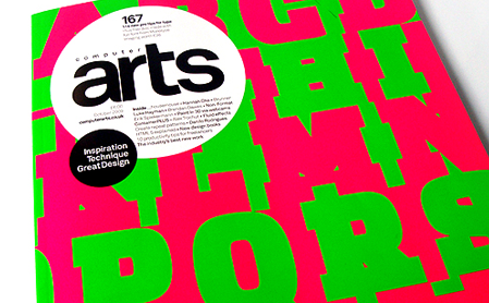
The October issue of Computer Arts Magazine speaks to 30 type practitioners around the globe who offer their expert advice on type design. From leading and kerning to managing fonts, designers reveal 114 pro type tips they follow to the letter. Here is a small excerpt with some of them: “…Never just shrink full-size caps down and call them small caps; they aren’t. If you are willing to go to the trouble of using real small caps, be sure to letter-space them properly, a little looser than lowercase” by John D Berry. “…Don’t bastardize type by stretching, skewing or altering it’s dimensions. Just like you wouldn’t stretch a photo or illustration, don’t do it to type. The results are ugly and will mark you as an amateur” by David John Earls. “…Give more than expected, add this extra value to your typeface without raising the price. But more is not always the merrier, it must be useful as well. You may decide to add some ornaments or concentrate on extra ligatures, but whatever you do, make sure it serves its purpose” by Panos Vassiliou.
