


Specimen
Test Driver
DIN Serif
This is the first ever release of a true serif companion for the popular DIN typeface. DIN Serif originated in a custom project for a watchmaking journal which required a modern serif to work in unison and match the inherent simplicity of DIN. As a result, a solid, confident and well-balanced typeface was developed which is simple and neutral enough when set at small sizes, but sturdy and powerful when set at heavier weights and bigger sizes.
€455.00 complete family
DIN Serif™
Copyright ©2016
Designer: Panos Vassiliou
This is the first ever release of a true serif companion for the popular DIN typeface. DIN Serif originated in a custom project for a watchmaking journal which required a modern serif to work in unison and match the inherent simplicity of DIN. As a result, a solid, confident and well-balanced typeface was developed which is simple and neutral enough when set at small sizes, but sturdy and powerful when set at heavier weights and bigger sizes.
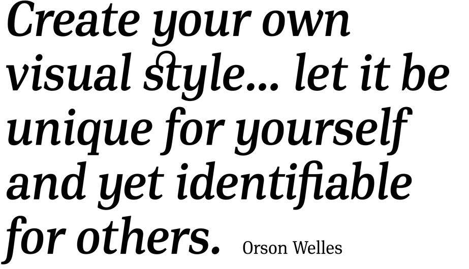
DIN Serif makes no attempt to impress with ephemeral nifty details on individual letters, but instead it concentrates on a few modern, functional and everlasting novelties which express an overall distinct quality on the page and set it apart from most classic romans. This is a low contrast typeface with vertical axis and squarish form which brings out a balance between simplicity and legibility. Its narrow proportions offer economy of space which is critical for newspaper body text and headlines. At small sizes the text has an even texture, it is comfortable and highly readable. The serifs are narrow at heavy weights and when tight typesetting is applied at large sizes, the heavier weights become ideal for headlines.
DIN Serif was inspired by late 19th century Egyptian and earlier transitional roman faces. Bracketed serifs were placed on the upper part of the letterforms (this is where we mostly concentrate our attention when we read) whereas small clean square serifs were placed on and under the baseline to simplify the letterforms. In order to reduce visual tension at the joins and make reading smooth and comfortable, a slight hint of bracketed serif was added at the joins in the form of a subtle angular tapered serif, to soften the harsh angularity. These angular tapered serifs tend to disappear at smaller sizes (or smooth out the joins) but stand out at bigger sizes exuding a strong, modern and energetic personality.
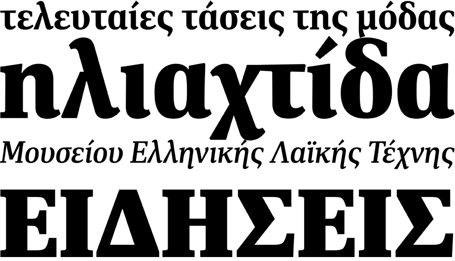
What started out as a custom 2 weight family, it has developed into a full scale superfamily with 10 styles from Regular to ExtraBlack along with their italics. Additional features were added such as small caps, alternate letters and numbers as well as numerous symbols for branding, signage and publishing. All weights were meticulously hinted for excellent display performance on the web. Finally, DIN Serif supports more that 100 languages such as those based on the Latin, Greek and Cyrillic alphabet.
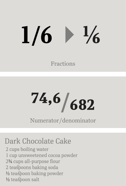
Fractions: Figures separated by slash, are replaced with diagonal fractions.
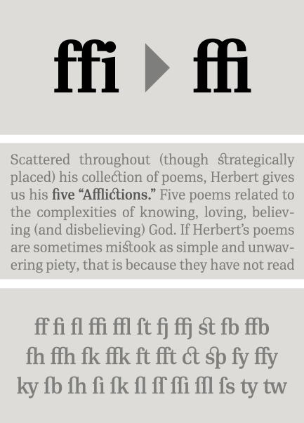
Ligatures : Replaces a sequence of glyphs with a single glyph, creating a professional-looking text with no peculiar collisions among letters. This feature covers the standard f-ligatures, as well as few other ones used in normal conditions.
Oldstyle figures : Changes selected figures from the default lining to oldstyle i.e. numbers of
varying height. These are appropriate for use with lowercase text. They come in two different styles:
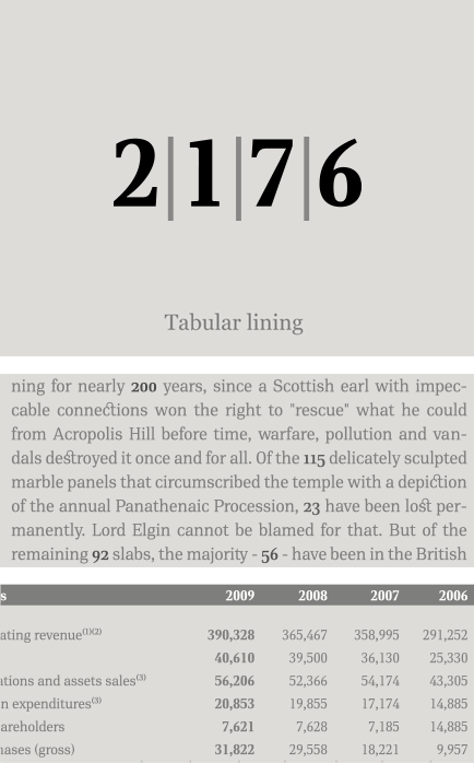
tabular and proportional. Tabular figures have equal widths (useful for tables, so that numbers line
up from one line to the next) whereas proportional have varying widths and are basically used within a sentence.
Lining figures : This feature changes selected figures from oldstyle to the default lining form. Lining figures are numbers which fit better with all-capital text and they are of the same height as capitals or a bit smaller. They also come in two different styles: tabular and proportional.
Proportional figures : Replaces selected figure glyphs which are set on tabular widths (lining or oldstyle), with corresponding glyphs set on proportional widths (lining or oldstyle).
Tabular figures : Replaces selected figure glyphs which are set on proportional widths (lining or oldstyle), with corresponding glyphs set on tabular widths (lining or oldstyle).
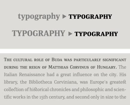
Small Caps: This feature formats lowercase text as small caps. These are not computer generated scaled-down versions of capitals, but rather glyphs which have been designed to match the weight and proportions of the rest of the family characters. They are often used in combination with oldstyle figures, for acronyms and abbreviations and stylistically at the beginning of a paragraph (this feature includes Latin and Cyrillic small caps).
Small Caps from Capitals: Replaces capital glyphs with small caps (this feature includes Latin and Cyrillic small caps).
Stylistic Alternates: Replaces non-standard glyphs with alternate forms purely for aesthetic reasons.
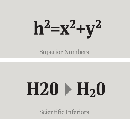
Superiors: Replaces lining and oldstyle figures with superior figures and lowercase letters with
superior letters. These superior glyphs are not computer generated scaled-down versions but are rather
redesigned to match the weight of the regular glyphs. Superior figures are used mainly for footnotes
and superior letters for abbreviated titles (this feature includes Latin as well as Greek superior
lowercase and capital letters).
Scientific inferiors: Replaces lining and oldstyle figures with inferior figures. They have been
designed to match the weight of the regular glyphs and sit lower than the standard baseline. Used
primarily for mathematical and chemical notations.
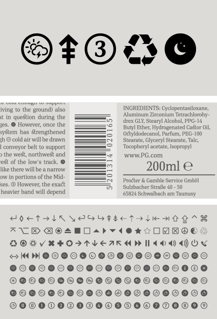
Ornaments/Various Symbols : This feature may replace the bullet or other characters with any of the available ornaments/symbols. All of them are best accessed from the program’s ‘Glyphs Palette’ when available. There is a total of 100 ornaments/symbols included for packaging, public areas, environment, transportation, computers, fabric care, urban life.
SCRIPTS
1250 Eastern European , 1251 Cyrillic , 1252 Latin 1 , 1253 Greek , Greek Extended , 1254 Turkish , 1257 BalticSUPPORTED LANGUAGES
Albanian, Bosnian (Latin), Croatian, Czech, Hungarian, Polish, Romanian, Slovak, Slovenian, Sorbian, Azeri (Cyrillic), Belarusian, Bosnian (Cyrillic), Bulgarian, Kyrgyz, Macedonian (FYROM), Moldovian, Mongolian, Russian, Serbian, Tatar, Ukrainian, Uzbek (Cyrillic), Afrikaans, Alsatian, Basque, Bislama, Breton, Catalan, Chamorro, Danish, Dutch, English, Faroese, Finnish, Flemish, Franco-Provencal, French, Frisian, Friulian, Galician, German, Greenlandic, Icelandic, Indonesian, Irish, Italian, Ladin, Latin, Luxembourgish, Malay, ManxGaelic, Norwegian (Bokmål), Norwegian (Nynorsk), Occitan, Portuguese, Rhaeto-Romance, Romansh, Sami (Inari), Sami (Lule), Sami (Skolt), Sami (Southern), ScottishGaelic, Spanish, Swahili, Swedish, Tagalog, Walloon, Welsh, Greek, GreekPolytonic, Azeri (Latin), Kurdish (Latin), Turkish, Uzbek (Latin), Estonian, Latvian, LithuanianNAME
PF DIN SerifFORMAT
OpenType PSPACKAGE
Family of 10 fonts (also available as separate weights)GLYPHS
1376 glyphs /font
PRO FEATURES
Small Caps, Standard f-Ligatures, Oldstyle Figures (tabular/proportional), Lining Figures (tabular/proportional), Superiors (numerals/lowercase letters), Scientific Inferiors, Fractions, Numerators / denominators, Capital spacing, Stylistic alternates, Ornaments/various symbols.
PRICE
family: €455.00
single weight: €65.00