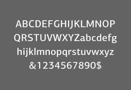
Selected Works

pages:

Pages

  • Samsung
    Direct | 2011

    Samsung

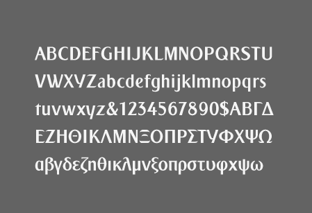
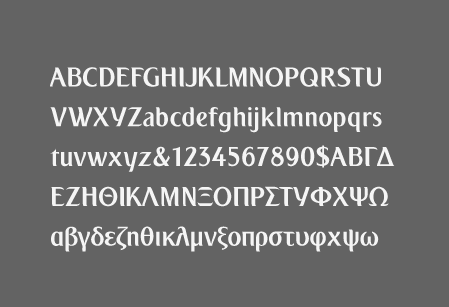
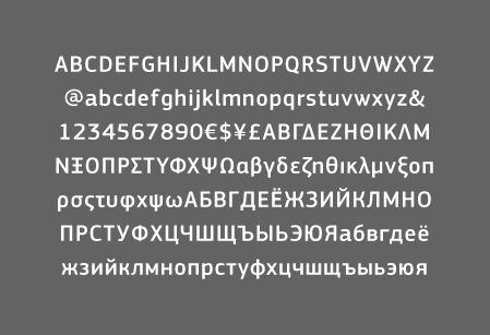
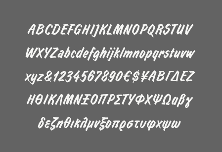
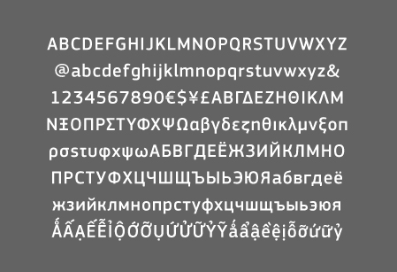
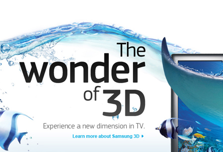
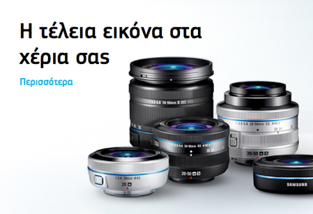
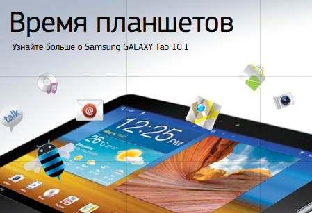
    For Samsung’s global website which incorporates Square Sans Pro as the main typeface, Parachute was asked to provide its technical skills and advice for a smooth, fast and problem-free operation in all different languages as well as design additional characters for certain regions.

  • European Football Association
    Direct | 2013

    European Football Association

    TBA

  • Emirates
    Grey | 2012

    Emirates

    Emirates is is a globally influential airline conglomerate based in the United Arab Emirates. Recently, its advertising agency Grey was working on its new campaign when they asked Parachute to design a matching Greek version of its corporate typeface, altogether in six weights.

  • European Commission
    Direct | 2012

    European Commission

    The European Commission went recently through a major re-branding and a custom version of Square Sans Pro was selected as its official typeface. Parachute was asked to redesign certain characters to EC’s specifications, design letterforms for additional languages and provide technical support. Furthermore, a new condensed version of Square Sans Pro was designed.

  • KfW Group
    Metadesign | 2013

    KfW Group

    The renowned agency MetaDesign has modernized KfW’s identity by developing a new concept and look. The logo, the typography, the imagery, in short the entire KfW appearance is revised and converted into a contemporary form. The old fonts were replaced with a customized version of the award-winning Centro Sans Pro family, which offers a great combination of classic and modern.

  • Albaghdadia TV
    Albaghdadia TV
    Velvet Mediendesign | 2010

    Albaghdadia TV

    While creating a new design for Albaghdadia TV, the German agency Velvet chose Square Sans Pro for its modern look and reliable appearance. Eventually they required a matching Arabic version. Parachute was asked to custom make one based on some very strict requirements of the specific TV station. See details in the Case Studies section.

  • Ikea
    Direct | 2001

    Ikea

    When Ikea opened its first stores in Greece, it commissioned Parachute to overlook its typographic integrity and create matching Greek versions of its corporate fonts particularly a 2-weight script typeface which is used in its catalogs and in-store signs.

  • Grazia magazine
    Grazia magazine
    Direct | 2009

    Grazia magazine

    For the consumptionwise and well-educated woman, Grazia magazine required a custom typeface that expressed the lifestyle of the modern woman. Parachute designed a series of 5 related superfamilies which emphasized the magazine’s personality. See details in the Case Studies section.