Financial Times FTD
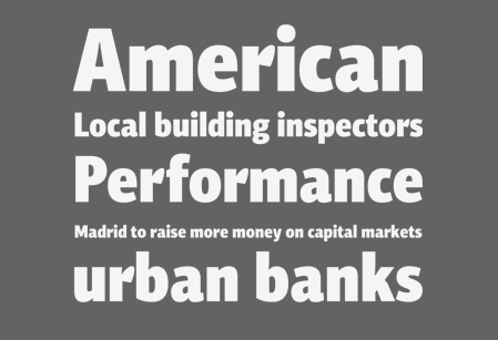
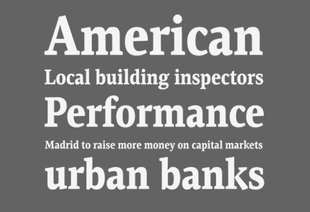
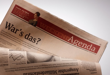
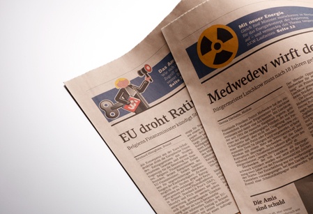
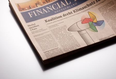
One of our most recent projects was the design of an extensive type system for the redesign of the Financial Times Deutschland. Design agency TwoType created the new layout and Parachute was commissioned to design a complete set of fonts which included a serif, a sans-serif and a slab version. Special versions were developed for headlines, body text, captions and charts.
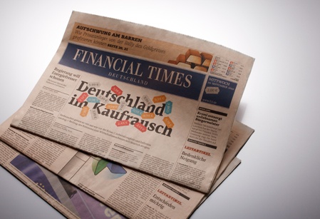
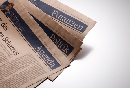
The new design and type treatment make the front page of the newspaper look more confident, whereas the structure of the heading, the expressive black headlines and the new column system with its consistent left-aligned text, enhance the identity of the Financial Times pages and create an uncluttered environment which is more reader-friendly. The text is kept long, offering more background information, but a stronger readable custom font is used, which retains the serious reputation of the newspaper.
One year after its redesign, Financial Times received an Award of Excellence from the European Newspaper Awards in the category nationwide front page and a second Award in the typography category.
(more about this project will follow)


