


Specimen
Test Driver
Regal Text Pro
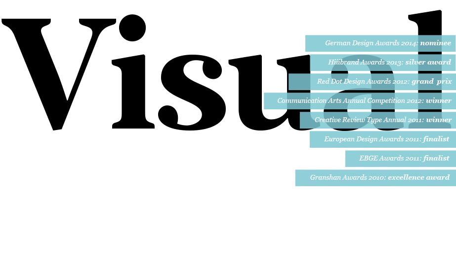
Regal Text Pro is a multi-award-winning typeface. Recently it received a red dot: best of the best 2012 award as part of the Regal Pro type system. This is a robust forward-thinking serif typeface which is ideal for magazines and newspapers, perfectly matched with the other members of the Regal type system
€625.00 complete family
PF Regal Text Pro
Copyright ©2010-2012
Designer: Panos Vassiliou
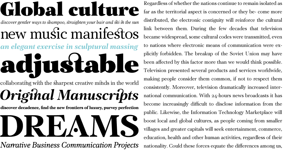
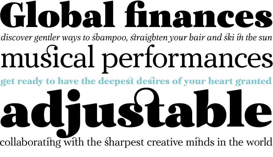
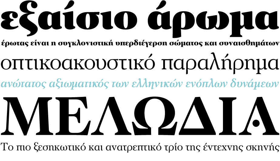
The objective of this project was to design a new typeface series for Grazia magazine. First published in 2010, Regal was later revamped and redesigned for commercial use, evolving into a type system with five related superfamilies. According to the brief, this typeface had to be elegant, luxurious, sexy, vibrant, reflect the female sensitivity and take into consideration a modern woman who is more proud, more connected, more spontaneous, open-minded and eager to try a whole host of new products and services. Targeting this consumption-wise and well-educated woman, required a typeface that is not strictly based on classic forms, but incorporates several distinct elements that express a modern woman’s personality and the products she consumes. In that respect, a whole series of 5 related superfamilies was designed, which not only emphasize femininity but also reflect both the romantic as well as the dynamic side of the female personality. For that matter, elegant curvy details were introduced in order to create a link to the female figure; teardrop terminals which reflect a woman’s sensitivity; pronounced quirks on upper and lower arms for her eyelashes; high-contrast, sharp corners at thinning terminals for her high heels; alternate glyphs for the woman who prefers to express her individuality -rather than slavishly follow trends- by using various accessories which can dramatically change her appearance; elegant endings and long curves to reflect her predisposition to dream; bell-shaped serifs with an inward rather than outward direction which recall streamlined seventies fashion. This series of typefaces is diverse in its construction as it consists of five related superfamilies i.e. text, display, finesse, swash and stencil. There is a variety of weights which range from regular to ultra black for each one of the five families. These families share common attributes but they differ in content according to each one’s usage. The whole superfamily type system is comprised of 47 weights with an average of 898 glyphs per weight. It supports simultaneously Latin, Cyrillic and Greek and comes with many alternate glyphs.
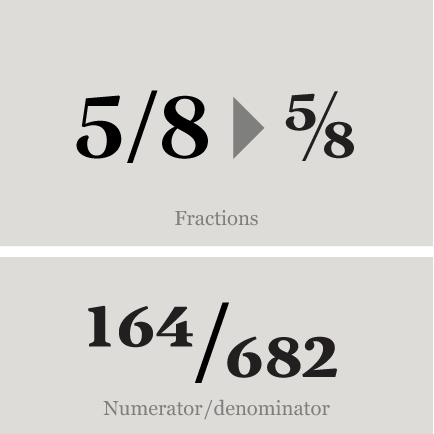
Fractions : Figures separated by slash, are replaced with diagonal fractions.
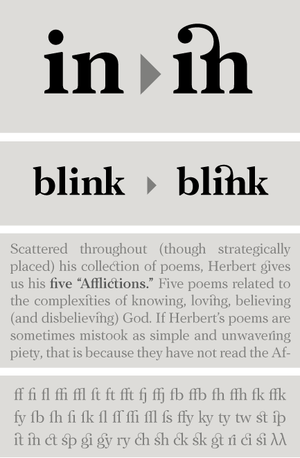
Ligatures: Replaces a sequence of glyphs with a single glyph, creating a professional-looking text with no peculiar collisions among letters. This feature covers the standard f-ligatures, as well as few other ones used in normal conditions.
Discretional ligatures: Replaces a sequence of glyphs with a single glyph. It differs from the previous feature in the fact that it activates special (non-standard) ligatures for Latin and Greek.
Oldstyle figures : Changes selected figures from the default lining to oldstyle i.e. numbers of
varying height. These are appropriate for use with lowercase text. They come in two different styles:
tabular and proportional. Tabular figures have equal widths (useful for tables, so that numbers line
up from one line to the next) whereas proportional have varying widths and are basically used within a sentence.
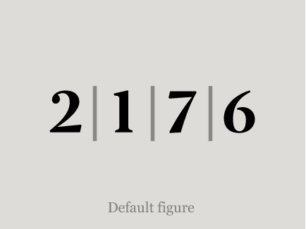
Lining figures : This feature changes selected figures from oldstyle to the default lining form. Lining figures are numbers which fit better with all-capital text and they are of the same height as capitals or a bit smaller. They also come in two different styles: tabular and proportional.
Proportional figures : Replaces selected figure glyphs which are set on tabular widths (lining or oldstyle), with corresponding glyphs set on proportional widths (lining or oldstyle).
Tabular figures : Replaces selected figure glyphs which are set on proportional widths (lining or oldstyle), with corresponding glyphs set on tabular widths (lining or oldstyle).
Ligatures: Replaces a sequence of glyphs with a single glyph, creating a professional-looking text with no peculiar collisions among letters. This feature covers the standard f-ligatures, as well as few other ones used in normal conditions.
Discretional ligatures: Replaces a sequence of glyphs with a single glyph. It differs from the previous feature in the fact that it activates special (non-standard) ligatures for Latin and Greek.
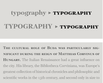
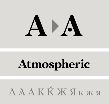
Stylistic Alternates : Replaces non-standard glyphs with alternate forms purely for aesthetic reasons.
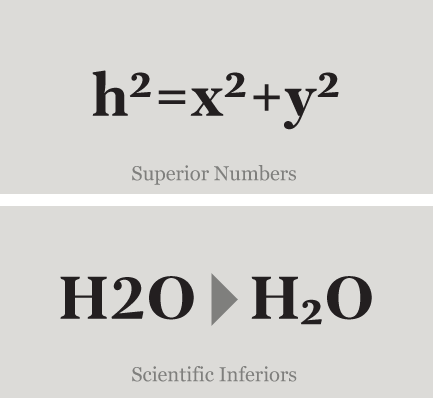
Superiors : Replaces lining and oldstyle figures with superior figures and lowercase letters with
superior letters. These superior glyphs are not computer generated scaled-down versions but are rather
redesigned to match the weight of the regular glyphs. Superior figures are used mainly for footnotes
and superior letters for abbreviated titles (this feature includes Latin as well as Greek superior
lowercase and capital letters).
Scientific inferiors : Replaces lining and oldstyle figures with inferior figures. They have been
designed to match the weight of the regular glyphs and sit lower than the standard baseline. Used
primarily for mathematical and chemical notations.


Paper magazine
Agency : Paper Magazine
Client : Paper Magazine
Project : Magazine Design


Grazia magazine
Agency : Attica Media Publications
Client : Grazia magazine
Project : Layout/Magazine Design


meduza
Client : meduza, the real Russia, today
Project : Branding/Identity/Website/Mobile Apps


SO SIMPLE
Client : Ethnos
Project : Magazine Design


TA NEA newspaper
Client : TA NEA
Project : Newspaper Design / Website


Eva Magazine
Agency : The Comeback
Client : Eva Magazine
Project : Magazine Design


Gynaika magazine
Client : Kathimerini
Project : Magazine Design
 image 1")
 image 2")
 image 3")
 image 4")
 image 5")
 image 1")
 image 2")
 image 3")
 image 4")
 image 5")
Cosmopolitan (RU/UA)
Client : Cosmopolitan (RU/UA)
Project : Magazine Design


Idaniko Spiti magazine
Client : Idaniko Spiti magazine
Project : Layout/Magazine Design
SCRIPTS
1250 Eastern European , 1251 Cyrillic , 1252 Latin 1 , 1253 Greek , 1254 Turkish , 1257 BalticSUPPORTED LANGUAGES
Albanian, Bosnian (Latin), Croatian, Czech, Hungarian, Polish, Romanian, Slovak, Slovenian, Sorbian, Azeri (Cyrillic), Belarusian, Bosnian (Cyrillic), Bulgarian, Kyrgyz, Macedonian (FYROM), Moldovian, Mongolian, Russian, Serbian, Tatar, Ukrainian, Uzbek (Cyrillic), Afrikaans, Alsatian, Basque, Bislama, Breton, Catalan, Chamorro, Danish, Dutch, English, Faroese, Finnish, Flemish, Franco-Provencal, French, Frisian, Friulian, Galician, German, Greenlandic, Icelandic, Indonesian, Irish, Italian, Ladin, Latin, Luxembourgish, Malay, ManxGaelic, Norwegian (Bokmål), Norwegian (Nynorsk), Occitan, Portuguese, Rhaeto-Romance, Romansh, Sami (Inari), Sami (Lule), Sami (Skolt), Sami (Southern), ScottishGaelic, Spanish, Swahili, Swedish, Tagalog, Walloon, Welsh, Greek, Azeri (Latin), Kurdish (Latin), Turkish, Uzbek (Latin), Estonian, Latvian, LithuanianNAME
PF Regal Text ProFORMAT
OpenType PSPACKAGE
Family of 10 fonts (also available as separate weights)GLYPHS
898 glyphs /font
PRO FEATURES
Access All Alternates, Case-Sensitive Forms, Small Caps, Capital Spacing, Discretionary Ligatures, Denominators, Fractions, Standard Ligatures, Lining Figures, Numerators, Oldstyle Figures, Ordinals, Ornaments, Proportional Figures, Scientific Inferiors, Small Capitals, Stylistic Alternates, Superscript, Tabular Figures, Slashed Zero
PRICE
family: €625.00
single weight: €65.00