

Specimen
Test Driver
Isotext Pro
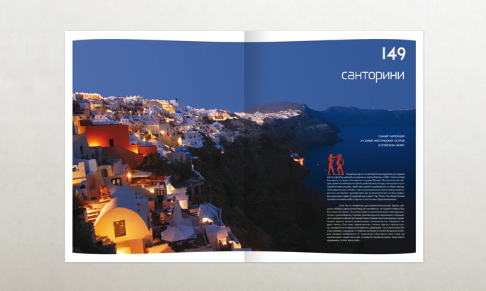
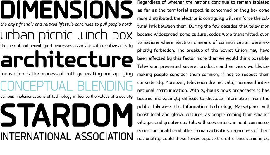
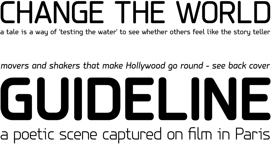
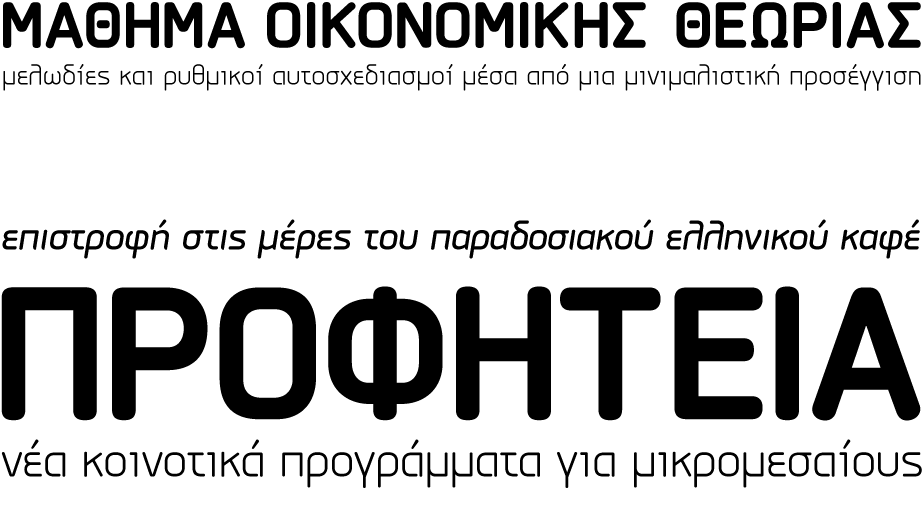
This typeface is based on iso 3098, a technical documentation issued in 1974 by ISO (International Organization for Standardization), which proposed a set of characters for use on technical drawings and associated documents. Isotext is based on the original standards but is completely redesigned to fit typographic requirements.
€295.00 complete family
Copyright ©2000-2005
Designer: Panos Vassiliou
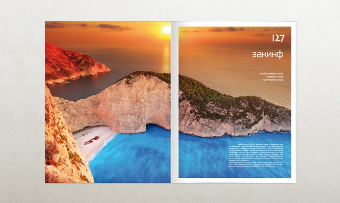
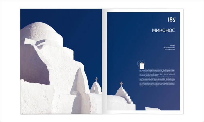
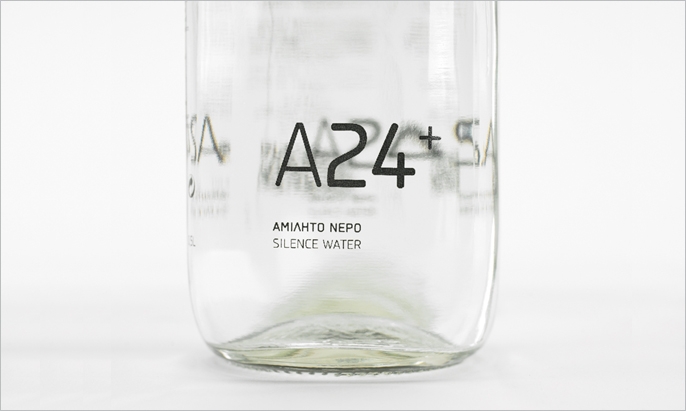
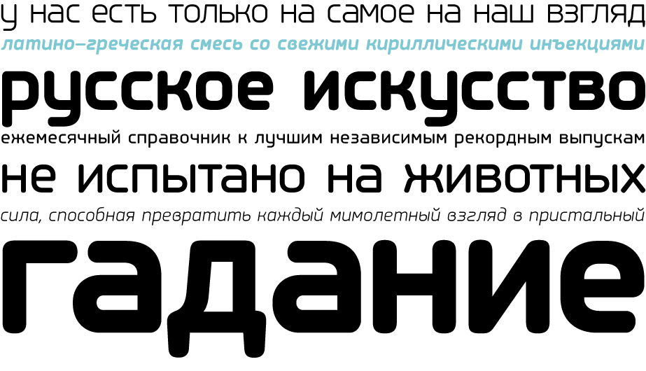
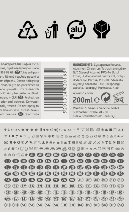
This typeface is based on iso 3098, a technical documentation issued in 1974 by ISO (International Organization for Standardization), which proposed a set of characters for use on technical drawings and associated documents. Isotext is based on the original standards but is completely redesigned to fit typographic requirements. This new ‘Pro’ version is further improved upon and now comes with a complete set of redesigned true-italics. Furthermore, the width of the glyphs has increased in order to establish a more balanced and readable text. The result is a contemporary font which works well in small sentences as well as long texts. Isotext Pro is loaded with all the good stuff a designer needs to create documents with attitude. It supports 19 special opentype features like small caps, fractions, ordinals, etc. and offers multilingual support for all European languages including Greek and Cyrillic. Finally, every font in this family has been completed with 270 copyright-free symbols, some of which have been proposed by several international organizations for packaging, public areas, environment, transportation, computers, fabric care and urban life
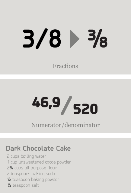
Fractions : Figures separated by slash, are replaced with diagonal fractions.
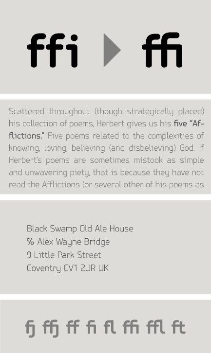
Ligatures: Replaces a sequence of glyphs with a single glyph, creating a professional-looking text with no peculiar collisions among letters. This feature covers the standard f-ligatures, as well as few other ones used in normal conditions.
Discretional ligatures: Replaces a sequence of glyphs with a single glyph. It differs from the previous feature in the fact that it activates special (non-standard) ligatures for Latin and Greek.
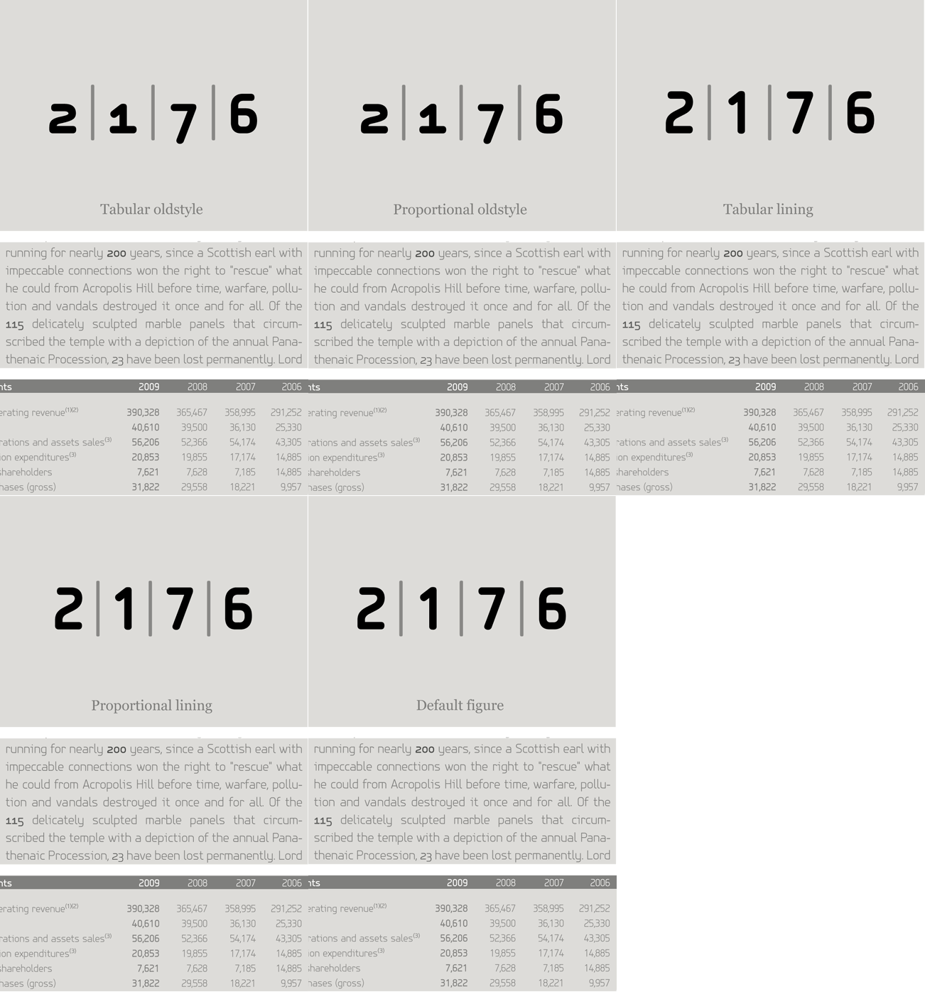
Oldstyle figures : Changes selected figures from the default lining to oldstyle i.e. numbers of
varying height. These are appropriate for use with lowercase text. They come in two different styles:
tabular and proportional. Tabular figures have equal widths (useful for tables, so that numbers line
up from one line to the next) whereas proportional have varying widths and are basically used within a sentence.
Lining figures : This feature changes selected figures from oldstyle to the default lining form. Lining figures are numbers which fit better with all-capital text and they are of the same height as capitals or a bit smaller. They also come in two different styles: tabular and proportional.
Proportional figures : Replaces selected figure glyphs which are set on tabular widths (lining or oldstyle), with corresponding glyphs set on proportional widths (lining or oldstyle).
Tabular figures : Replaces selected figure glyphs which are set on proportional widths (lining or oldstyle), with corresponding glyphs set on tabular widths (lining or oldstyle).
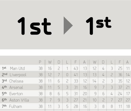
Ordinals: Contextually replaces default alphabetic glyphs which follow numbers with superscripted glyphs and the sequence ‘No’ with the numero character (No). This feature includes Latin as well as Greek lowercase and capital ordinals.
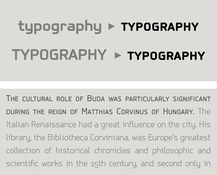
Small Caps: This feature formats lowercase text as small caps. These are not computer generated scaled-down versions of capitals, but rather glyphs which have been designed to match the weight and proportions of the rest of the family characters. They are often used in combination with oldstyle figures, for acronyms and abbreviations and stylistically at the beginning of a paragraph (this feature includes Latin, Greek and Cyrillic small caps).
Small Caps from Capitals: Replaces capital glyphs with small caps (this feature includes Latin, Greek and Cyrillic small caps).
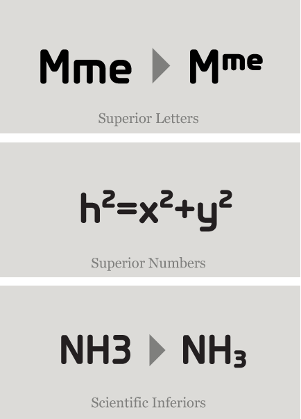
Superiors : Replaces lining and oldstyle figures with superior figures and lowercase letters with
superior letters. These superior glyphs are not computer generated scaled-down versions but are rather
redesigned to match the weight of the regular glyphs. Superior figures are used mainly for footnotes
and superior letters for abbreviated titles (this feature includes Latin as well as Greek superior
lowercase and capital letters).
Scientific inferiors : Replaces lining and oldstyle figures with inferior figures. They have been
designed to match the weight of the regular glyphs and sit lower than the standard baseline. Used
primarily for mathematical and chemical notations.
Ornaments/Various Symbols : This feature may replace the bullet or other characters with any of the available ornaments/symbols. All of them are best accessed from the program’s ‘Glyphs Palette’ when available. There is a total of 270 ornaments/symbols included for packaging, public areas, environment, transportation, computers, fabric care, urban life.
SCRIPTS
1250 Eastern European , 1258 Vietnamese , 1251 Cyrillic , 1252 Latin 1 , 1253 Greek , 1254 Turkish , 1257 BalticSUPPORTED LANGUAGES
Albanian, Bosnian (Latin), Croatian, Czech, Hungarian, Polish, Romanian, Slovak, Slovenian, Sorbian, Vietnamese, Azeri (Cyrillic), Belarusian, Bosnian (Cyrillic), Bulgarian, Kyrgyz, Macedonian (FYROM), Moldovian, Mongolian, Russian, Serbian, Tatar, Ukrainian, Uzbek (Cyrillic), Afrikaans, Alsatian, Basque, Bislama, Breton, Catalan, Chamorro, Danish, Dutch, English, Faroese, Finnish, Flemish, Franco-Provencal, French, Frisian, Friulian, Galician, German, Greenlandic, Icelandic, Indonesian, Irish, Italian, Ladin, Latin, Luxembourgish, Malay, ManxGaelic, Norwegian (Bokmål), Norwegian (Nynorsk), Occitan, Portuguese, Rhaeto-Romance, Romansh, Sami (Inari), Sami (Lule), Sami (Skolt), Sami (Southern), ScottishGaelic, Spanish, Swahili, Swedish, Tagalog, Walloon, Welsh, Greek, Azeri (Latin), Kurdish (Latin), Turkish, Uzbek (Latin), Estonian, Latvian, LithuanianNAME
PF Isotext ProFORMAT
OpenType PSPACKAGE
Family of 6 fonts (also available as separate weights)GLYPHS
1196 glyphs /font
incl. 270 special symbols
PRO FEATURES
Small Caps, Standard f-Ligatures, Discretionary Ligatures, Oldstyle Figures (tabular/proportional), Lining Figures (tabular/proportional), Superiors (numerals/lowercase letters), Scientific Inferiors, Fractions, Ordinals, Numerators / denominators, Capital spacing, Ornaments/various symbols.
PRICE
family: €295.00
single weight: €65.00

