


Specimen
Test Driver
Encore Sans Pro
Encore Sans Pro received a Silver from ED Awards 2010. This is a brand new contemporary typeface, a perfect alternative to your overused classic sans. Encore Sans Pro does not pretend being different but it does claim its own personality. It is simple and stylish. Encore Sans Pro is a humanistic sans serif which projects an image of reliability, authority and competence making it ideal for corporate applications.
€725.00 complete family
Copyright ©2009
Designer: Panos Vassilíou
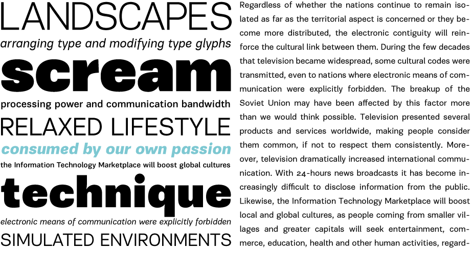
Encore Sans Pro received a Silver from ED Awards 2010. This is a brand new contemporary typeface, a perfect alternative to your overused classic sans. Encore Sans Pro does not pretend being different but it does claim its own personality. It is simple and stylish. Encore Sans Pro is a humanistic sans serif which projects an image of reliability, authority and competence making it ideal for corporate applications. A functional typeface which combines utility with style. Its subtle round characteristics such as the slightly curved-in edges, create a distinctly contemporary look, blending effectively traditional with modern details.
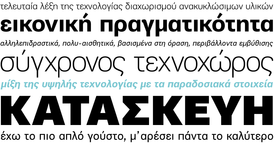
Encore Sans Pro is extremely versatile. It comes with 22 weights and supports simultaneously Latin, Greek and Cyrillic. Each font contains 1535 glyphs and is loaded with 22 advanced opentype features. Extreme weights, such as the elegant hairline, are carefully designed to establish an even color throughout, while ultra black despite its heavy characteristics is quite legible and powerful. Other intermediate weights such as light and book are ideal as body text for magazines and catalogs. Every font in this series has been completed with 270 copyright-free symbols, for packaging, public areas, environment, transportation, computers, fabric care and urban life.
Encore Sans Pro is based on an earlier Parachute® design which was released back in 2005 as PRC Fidelity. It was immediately picked up as an exclusive corporate typeface by a major communications company for a period of time. It was revisited some years later in 2007 but what seemed disturbing at the moment was the open form of letters like c, s, a which minimized the effectiveness of this typeface at heavy weights. After a few adjustments it was realized that closed letterforms offered better balance and stability to this particular typeface so it was decided to apply it to the whole series. Additional weights were designed and further support for Latin, Greek and Cyrillic.
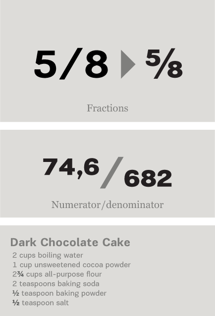
Fractions : Figures separated by slash, are replaced with diagonal fractions.
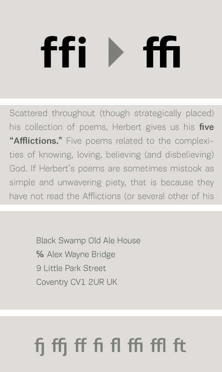
Ligatures: Replaces a sequence of glyphs with a single glyph, creating a professional-looking text with no peculiar collisions among letters. This feature covers the standard f-ligatures, as well as few other ones used in normal conditions.
Discretional ligatures:
Replaces a sequence of glyphs with a single glyph. It differs from the previous feature in the fact that it activates special (non-standard) ligatures for Latin and Greek.
Oldstyle figures : Changes selected figures from the default lining to oldstyle i.e. numbers of
varying height. These are appropriate for use with lowercase text. They come in two different styles:
tabular and proportional. Tabular figures have equal widths (useful for tables, so that numbers line
up from one line to the next) whereas proportional have varying widths and are basically used within a sentence.
Lining figures : This feature changes selected figures from oldstyle to the default lining form. Lining figures are numbers which fit better with all-capital text and they are of the same height as capitals or a bit smaller. They also come in two different styles: tabular and proportional.
Proportional figures : Replaces selected figure glyphs which are set on tabular widths (lining or oldstyle), with corresponding glyphs set on proportional widths (lining or oldstyle).
Tabular figures : Replaces selected figure glyphs which are set on proportional widths (lining or oldstyle), with corresponding glyphs set on tabular widths (lining or oldstyle).
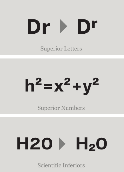
Ordinals : Contextually replaces default alphabetic glyphs which follow numbers with superscripted glyphs and the sequence ‘No’ with the numero character (No). This feature includes Latin as well as Greek lowercase and capital ordinals.
Small Caps: This feature formats lowercase text as small caps. These are not computer generated scaled-down versions of capitals, but rather glyphs which have been designed to match the weight and proportions of the rest of the family characters. They are often used in combination with oldstyle figures, for acronyms and abbreviations and stylistically at the beginning of a paragraph (this feature includes Latin, Greek and Cyrillic small caps).
Small Caps from Capitals: Replaces capital glyphs with small caps (this feature includes Latin, Greek and Cyrillic small caps).
Stylistic Alternates : Replaces non-standard glyphs with alternate forms purely for aesthetic reasons.
Superiors : Replaces lining and oldstyle figures with superior figures and lowercase letters with
superior letters. These superior glyphs are not computer generated scaled-down versions but are rather
redesigned to match the weight of the regular glyphs. Superior figures are used mainly for footnotes
and superior letters for abbreviated titles (this feature includes Latin as well as Greek superior
lowercase and capital letters).
Scientific inferiors : Replaces lining and oldstyle figures with inferior figures. They have been
designed to match the weight of the regular glyphs and sit lower than the standard baseline. Used
primarily for mathematical and chemical notations.
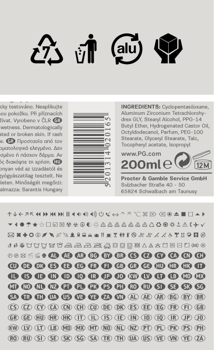
Ornaments/Various Symbols : This feature may replace the bullet or other characters with any of the available ornaments/symbols. All of them are best accessed from the program’s ‘Glyphs Palette’ when available. There is a total of 270 ornaments/symbols included for packaging, public areas, environment, transportation, computers, fabric care, urban life.


Small wonders of Rome
Agency : A Book From Lind / Denmark
Project : Brochure/City guide


Travel + Leisure magazine
Agency : Pentagram
Client : Travel + Leisure magazine / USA
Project : Layout/Magazine Design


TC Today
Agency : Columbia University / USA
Client : Columbia University / USA
Project : Layout/Magazine Design


Grazia magazine
Agency : Grazia magazine
Client : Grazia magazine
Project : Layout/Magazine Design


Encore Magazine
Agency : Encore Magazine / Switzerland
Client : Encore Magazine / Switzerland
Project : Layout/Magazine Design


Kinski
Agency : i_d buero / Germany
Client : Edel
Project : Book Design


Fleriana
Agency : Mouse Graphics
Client : Fleriana
Project : Packaging


Publikt Magazine
Agency : A4 /Sweden
Client : Publikt Newspaper
Project : Layout/Newspaper Design


Barbastathis
Agency : Mousegraphics
Client : Barbastathis
Project : Packaging

Piraeus Bank TVC
Client : Piraeus Bank
Project : TV Spot
SCRIPTS
1250 Eastern European , 1258 Vietnamese , 1251 Cyrillic , 1252 Latin 1 , 1253 Greek , Greek Extended , 1254 Turkish , 1257 BalticSUPPORTED LANGUAGES
Albanian, Bosnian (Latin), Croatian, Czech, Hungarian, Polish, Romanian, Slovak, Slovenian, Sorbian, Vietnamese, Azeri (Cyrillic), Belarusian, Bosnian (Cyrillic), Bulgarian, Kyrgyz, Macedonian (FYROM), Moldovian, Mongolian, Russian, Serbian, Tatar, Ukrainian, Uzbek (Cyrillic), Afrikaans, Alsatian, Basque, Bislama, Breton, Catalan, Chamorro, Danish, Dutch, English, Faroese, Finnish, Flemish, Franco-Provencal, French, Frisian, Friulian, Galician, German, Greenlandic, Icelandic, Indonesian, Irish, Italian, Ladin, Latin, Luxembourgish, Malay, ManxGaelic, Norwegian (Bokmål), Norwegian (Nynorsk), Occitan, Portuguese, Rhaeto-Romance, Romansh, Sami (Inari), Sami (Lule), Sami (Skolt), Sami (Southern), ScottishGaelic, Spanish, Swahili, Swedish, Tagalog, Walloon, Welsh, Greek, GreekPolytonic, Azeri (Latin), Kurdish (Latin), Turkish, Uzbek (Latin), Estonian, Latvian, LithuanianNAME
PF Encore Sans ProFORMAT
OpenType PSPACKAGE
Family of 22 fonts (also available as separate weights)GLYPHS
1535 glyphs /font
incl. 270 special symbols
PRO FEATURES
Small Caps, Standard f-Ligatures, Discretionary Ligatures, Oldstyle Figures (tabular/proportional), Lining Figures (tabular/proportional), Superiors (numerals/lowercase letters), Scientific Inferiors, Fractions, Ordinals, Stylistic Alternates, Numerators / denominators, Capital spacing, Ornaments/various symbols
PRICE
family: €725.00
single weight: €65.00