


Specimen
Test Driver
Das Grotesk Pro
Das Grotesk was inspired by earlier nineteenth-century grotesques, but it is much more related to American gothic designs such as those by M.F. Benton. Due to their pure geometric structure, most grotesque typefaces tend to have a rather monotonous and lifeless appearance, thus failing to express the ideals of the modern creed.
€585.00 complete family
Das Grotesk Pro
Copyright ©2013
Designer: Panos Vassiliou
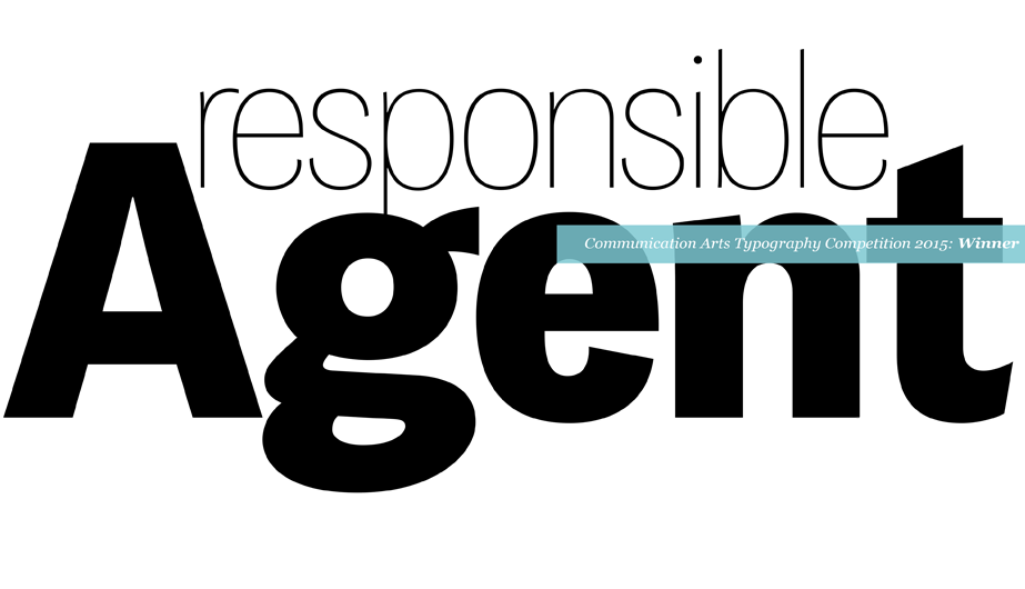
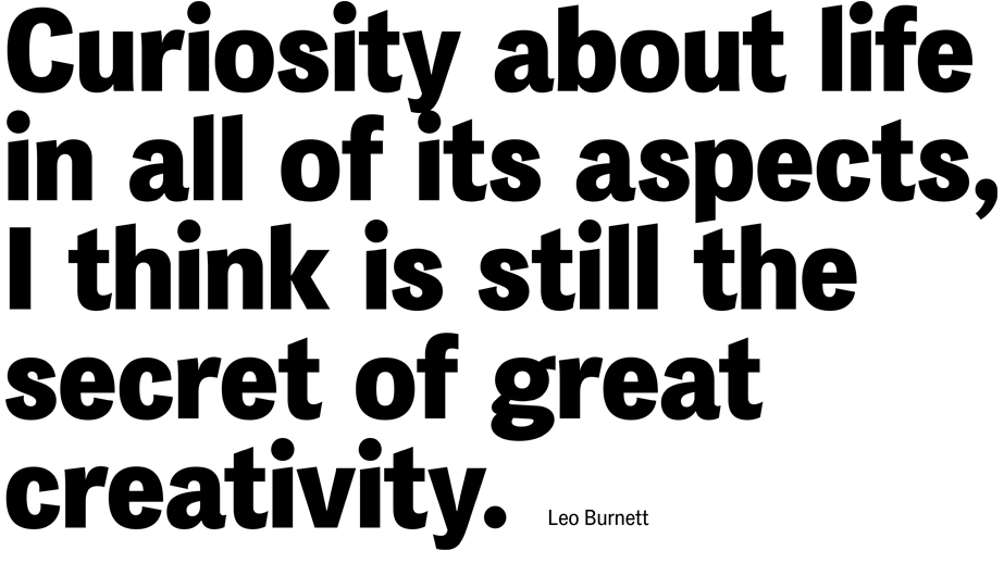
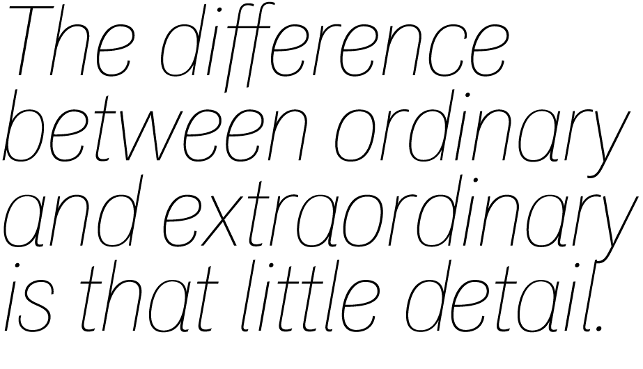
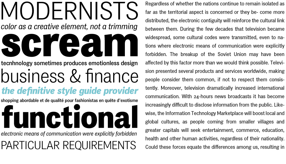
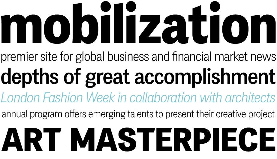
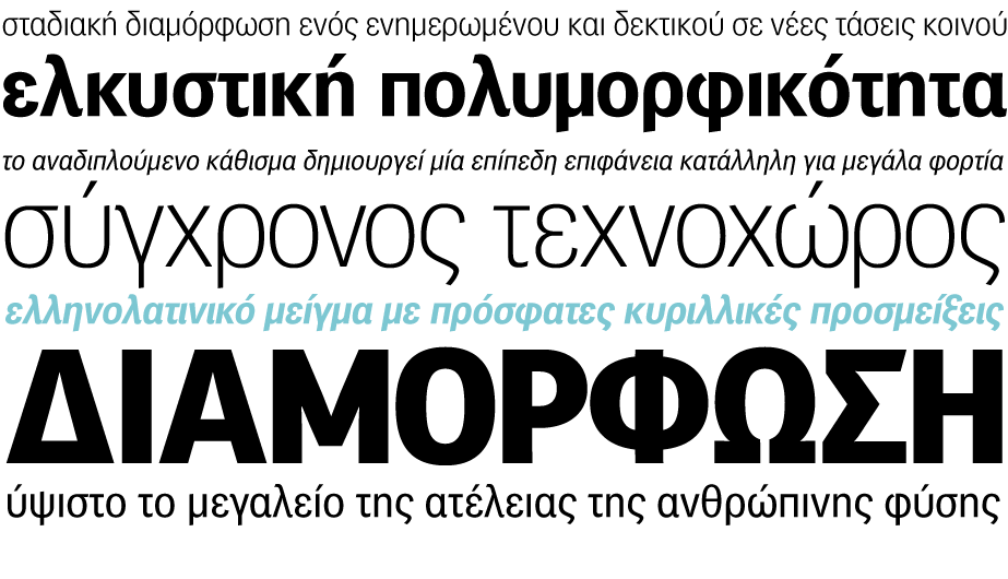
Das Grotesk was inspired by earlier nineteenth-century grotesques, but it is much more related to American gothic designs such as those by M.F. Benton. Due to their pure geometric structure, most grotesque typefaces tend to have a rather monotonous and lifeless appearance, thus failing to express the ideals of the modern creed. Das Grotesk on the other hand is a lively design with several distinguishable characteristics which attract attention when set at large sizes, whilst they become subtle and blend evenly at small sizes, fostering a neutral identity. This is a very legible and space-saving typeface with a narrow structure. It was designed with slanted curved ends and sheared terminals applied on several straight strokes. It has two-storey ‘a’ and ‘g’ but includes single-storey alternates. The family consists of 14 weights ranging from Extra Thin to Black (including true-italics). It provides simultaneous support for Latin, Cyrillic and Greek and is loaded with several advanced typographic features such as small caps. Most recently, Das Grotesk received an award from the Communications Arts Typography Competition 2015. For additional details download the specimen manual.
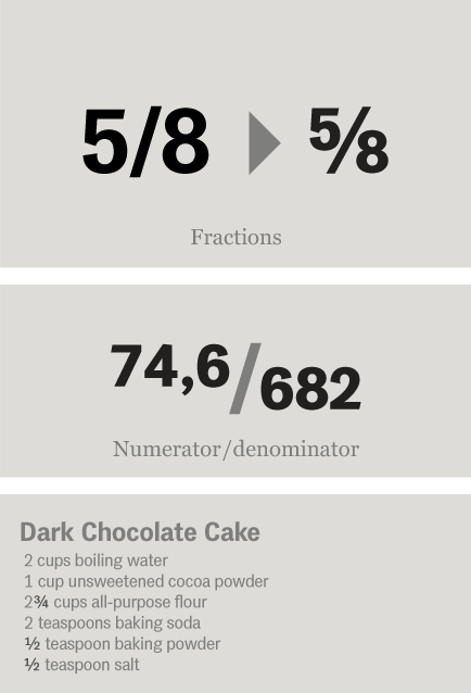
Fractions : Figures separated by slash, are replaced with diagonal fractions.
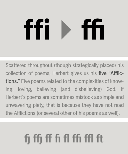
Ligatures : Replaces a sequence of glyphs with a single glyph, creating a professional-looking text with no peculiar collisions among letters. This feature covers the standard f-ligatures, as well as few other ones used in normal conditions.
Oldstyle figures : Changes selected figures from the default lining to oldstyle i.e. numbers of
varying height. These are appropriate for use with lowercase text. They come in two different styles:
tabular and proportional. Tabular figures have equal widths (useful for tables, so that numbers line
up from one line to the next) whereas proportional have varying widths and are basically used within a sentence.
Lining figures : This feature changes selected figures from oldstyle to the default lining form. Lining figures are numbers which fit better with all-capital text and they are of the same height as capitals or a bit smaller. They also come in two different styles: tabular and proportional.
Proportional figures : Replaces selected figure glyphs which are set on tabular widths (lining or oldstyle), with corresponding glyphs set on proportional widths (lining or oldstyle).
Tabular figures : Replaces selected figure glyphs which are set on proportional widths (lining or oldstyle), with corresponding glyphs set on tabular widths (lining or oldstyle).
Ordinals : Contextually replaces default alphabetic glyphs which follow numbers with superscripted glyphs and the sequence ‘No’ with the numero character (No). This feature includes Latin as well as Greek lowercase and capital ordinals.
Small Caps : This feature formats lowercase text as small caps. These are not computer generated scaled-down versions of capitals, but rather glyphs which have been designed to match the weight and proportions of the rest of the family characters. They are often used in combination with oldstyle figures, for acronyms and abbreviations and stylistically at the beginning of a paragraph (this feature includes Latin and Greek small caps).
Small Caps from Capitals : Replaces capital glyphs with small caps (this feature includes Latin and Greek small caps).
Stylistic Alternates : Replaces non-standard glyphs with alternate forms purely for aesthetic reasons.
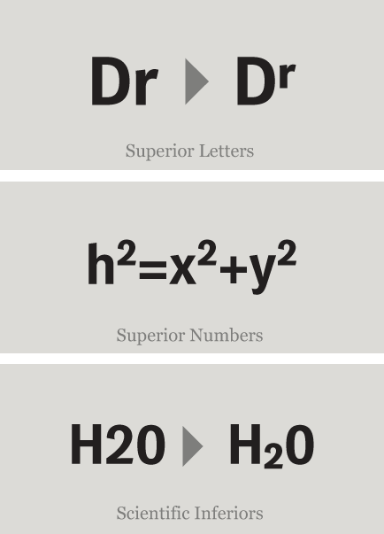
Superiors : Replaces lining and oldstyle figures with superior figures and lowercase letters with
superior letters. These superior glyphs are not computer generated scaled-down versions but are rather
redesigned to match the weight of the regular glyphs. Superior figures are used mainly for footnotes
and superior letters for abbreviated titles (this feature includes Latin as well as Greek superior
lowercase and capital letters).
Scientific inferiors : Replaces lining and oldstyle figures with inferior figures. They have been
designed to match the weight of the regular glyphs and sit lower than the standard baseline. Used
primarily for mathematical and chemical notations.
SCRIPTS
1250 Eastern European , 1251 Cyrillic , 1252 Latin 1 , 1253 Greek , Greek Extended , 1254 Turkish , 1257 BalticSUPPORTED LANGUAGES
Albanian, Bosnian (Latin), Croatian, Czech, Hungarian, Polish, Romanian, Slovak, Slovenian, Sorbian, Azeri (Cyrillic), Belarusian, Bosnian (Cyrillic), Bulgarian, Kyrgyz, Macedonian (FYROM), Moldovian, Mongolian, Russian, Serbian, Tatar, Ukrainian, Uzbek (Cyrillic), Afrikaans, Alsatian, Basque, Bislama, Breton, Catalan, Chamorro, Danish, Dutch, English, Faroese, Finnish, Flemish, Franco-Provencal, French, Frisian, Friulian, Galician, German, Greenlandic, Icelandic, Indonesian, Irish, Italian, Ladin, Latin, Luxembourgish, Malay, ManxGaelic, Norwegian (Bokmål), Norwegian (Nynorsk), Occitan, Portuguese, Rhaeto-Romance, Romansh, Sami (Inari), Sami (Lule), Sami (Skolt), Sami (Southern), ScottishGaelic, Spanish, Swahili, Swedish, Tagalog, Walloon, Welsh, Greek, GreekPolytonic, Azeri (Latin), Kurdish (Latin), Turkish, Uzbek (Latin), Estonian, Latvian, LithuanianNAME
PF Das Grotesk ProFORMAT
OpenType PSPACKAGE
Family of 14 fonts (also available as separate weights)GLYPHS
1186 glyphs /font
PRO FEATURES
Small Caps, Standard f-Ligatures, Discretionary Ligatures, Oldstyle Figures (tabular/proportional), Lining Figures (tabular/proportional), Superiors (numerals/lowercase letters), Scientific Inferiors, Fractions, Ordinals, Localized Forms, Stylistic Alternates, Numerators / denominators, Capital spacing, Stylistic Set 1 & 2
PRICE
family: €585.00
single weight: €65.00