


Specimen
Test Driver
Das Grotesk Mono Pro
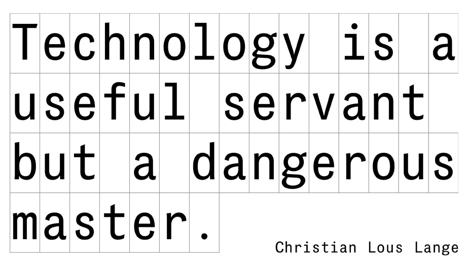
Das Grotesk Mono is based on the popular Das Grotesk Pro which was inspired by earlier nineteenth-century grotesques. Due to their pure geometric structure, most grotesque typefaces tend to have a rather monotonous and lifeless appearance. Das Grotesk on the other hand is a lively design with several distinguishable characteristics.
€585.00 complete family
Das Grotesk Mono Pro
Copyright ©2015
Designer: Panos Vassiliou
Das Grotesk Mono is based on the popular Das Grotesk Pro which was inspired by earlier nineteenth-century grotesques. Due to their pure geometric structure, most grotesque typefaces tend to have a rather monotonous and lifeless appearance. Das Grotesk on the other hand is a lively design with several distinguishable characteristics such as the slanted curved ends and sheared terminals. It has two-storey ‘a’ and ‘g’ but includes single-storey alternates as well. Das Grotesk Mono is one of the very few monospaced typefaces with simultaneous support for Latin, Cyrillic and Greek in extreme weights such as Black. This is truly a very stressful combination due mainly to the extended width of Cyrillic letterforms in heavy weights which makes it quite a challenge to fit all letterforms within a fixed width in order to preserve the monospaced nature and legibility of this typeface. The family consists of 14 weights ranging from Extra Thin to Black (including true-italics).
SCRIPTS
1250 Eastern European , 1251 Cyrillic , 1252 Latin 1 , 1253 Greek , 1254 Turkish , 1257 BalticSUPPORTED LANGUAGES
Albanian, Bosnian (Latin), Croatian, Czech, Hungarian, Polish, Romanian, Slovak, Slovenian, Sorbian, Azeri (Cyrillic), Belarusian, Bosnian (Cyrillic), Bulgarian, Kyrgyz, Macedonian (FYROM), Moldovian, Mongolian, Russian, Serbian, Tatar, Ukrainian, Uzbek (Cyrillic), Afrikaans, Alsatian, Basque, Bislama, Breton, Catalan, Chamorro, Danish, Dutch, English, Faroese, Finnish, Flemish, Franco-Provencal, French, Frisian, Friulian, Galician, German, Greenlandic, Icelandic, Indonesian, Irish, Italian, Ladin, Latin, Luxembourgish, Malay, ManxGaelic, Norwegian (Bokmål), Norwegian (Nynorsk), Occitan, Portuguese, Rhaeto-Romance, Romansh, Sami (Inari), Sami (Lule), Sami (Skolt), Sami (Southern), ScottishGaelic, Spanish, Swahili, Swedish, Tagalog, Walloon, Welsh, Greek, Azeri (Latin), Kurdish (Latin), Turkish, Uzbek (Latin), Estonian, Latvian, LithuanianNAME
PF Das Grotesk Mono ProFORMAT
OpenType PSPACKAGE
Family of 14 fonts (also available as separate weights)GLYPHS
595 glyphs per font
PRO FEATURES
No
PRICE
family: €585.00single weight: €65.00