





Specimen
Test Driver
Centro Slab Press
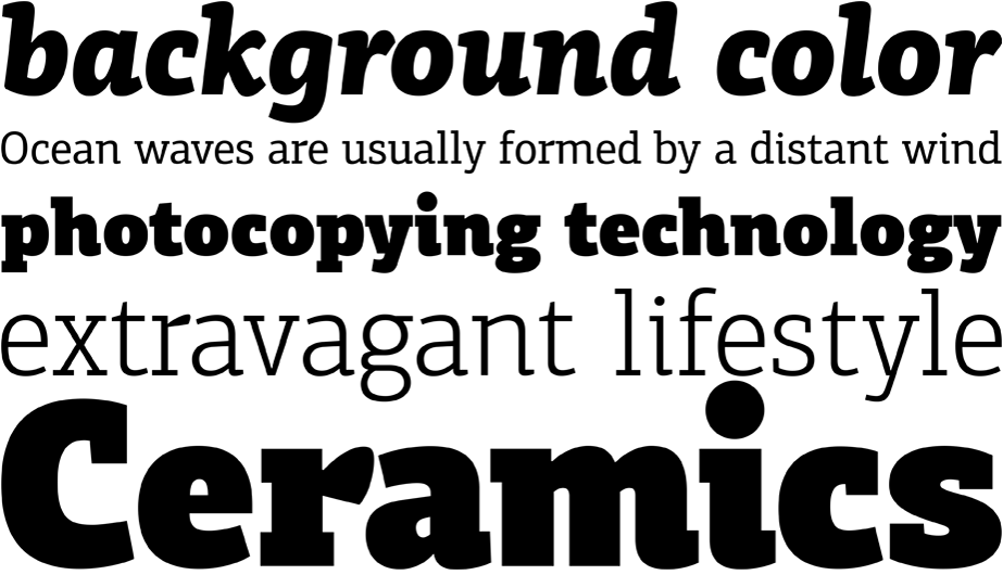
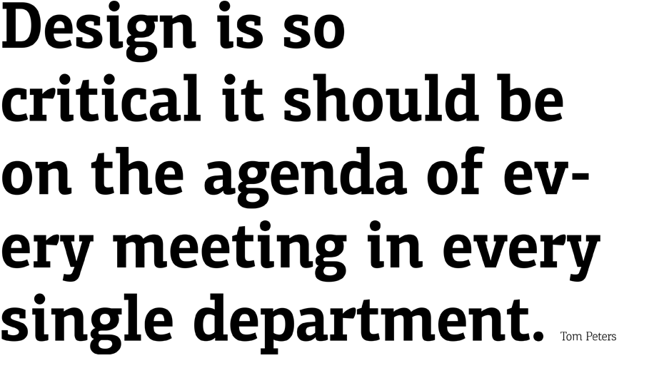
Ever since its first release, Centro Slab has been particularly popular with corporate applications, branding and print media. The new Centro Slab Press version was redesigned with narrower proportions which are better suited for publications such as magazines and newspapers as well as web applications. Centro Slab Press is a very clean and legible typeface even at heavier weights, a characteristic which is not often seen among slab typefaces.
€625.00 complete family
Centro® Slab Press
Copyright ©2016
Designer: Panos Vassiliou
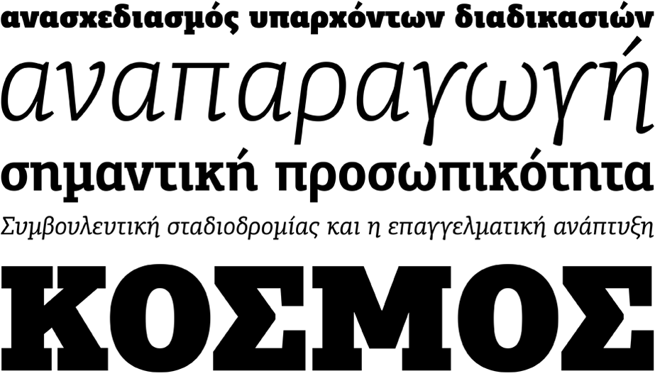
Ever since its first release, Centro Slab has been particularly popular with corporate applications, branding and print media. The new Centro Slab Press version was redesigned with narrower proportions which are better suited for publications such as magazines and newspapers as well as web applications. Centro Slab Press is a very clean and legible typeface even at heavier weights, a characteristic which is not often seen among slab typefaces. This is part due to the fact that Centro Slab Press is not overpowered by clumsy serifs. Instead it incorporates semi-slabs which provide comfortable reading without compromising its modern profile. The italics are narrower than the romans and incorporate beautiful cursive characteristics. Each style consists of 659 glyphs with several opentype features and an extended set of characters which support more that 100 languages such as those based on the Latin, Greek and Cyrillic alphabet.
The family is comprised of 16 styles from ExtraThin to UltraBlack along with their italics. All weights were meticulously hinted for excellent display performance on the web.
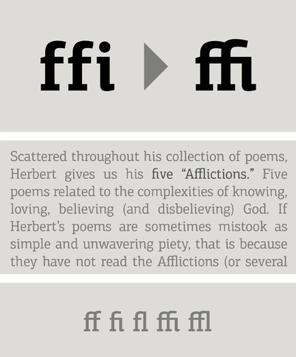
Ligatures : Replaces a sequence of glyphs with a single glyph, creating a professional-looking text with no peculiar collisions among letters. This feature covers the standard f-ligatures, as well as few other ones used in normal conditions.
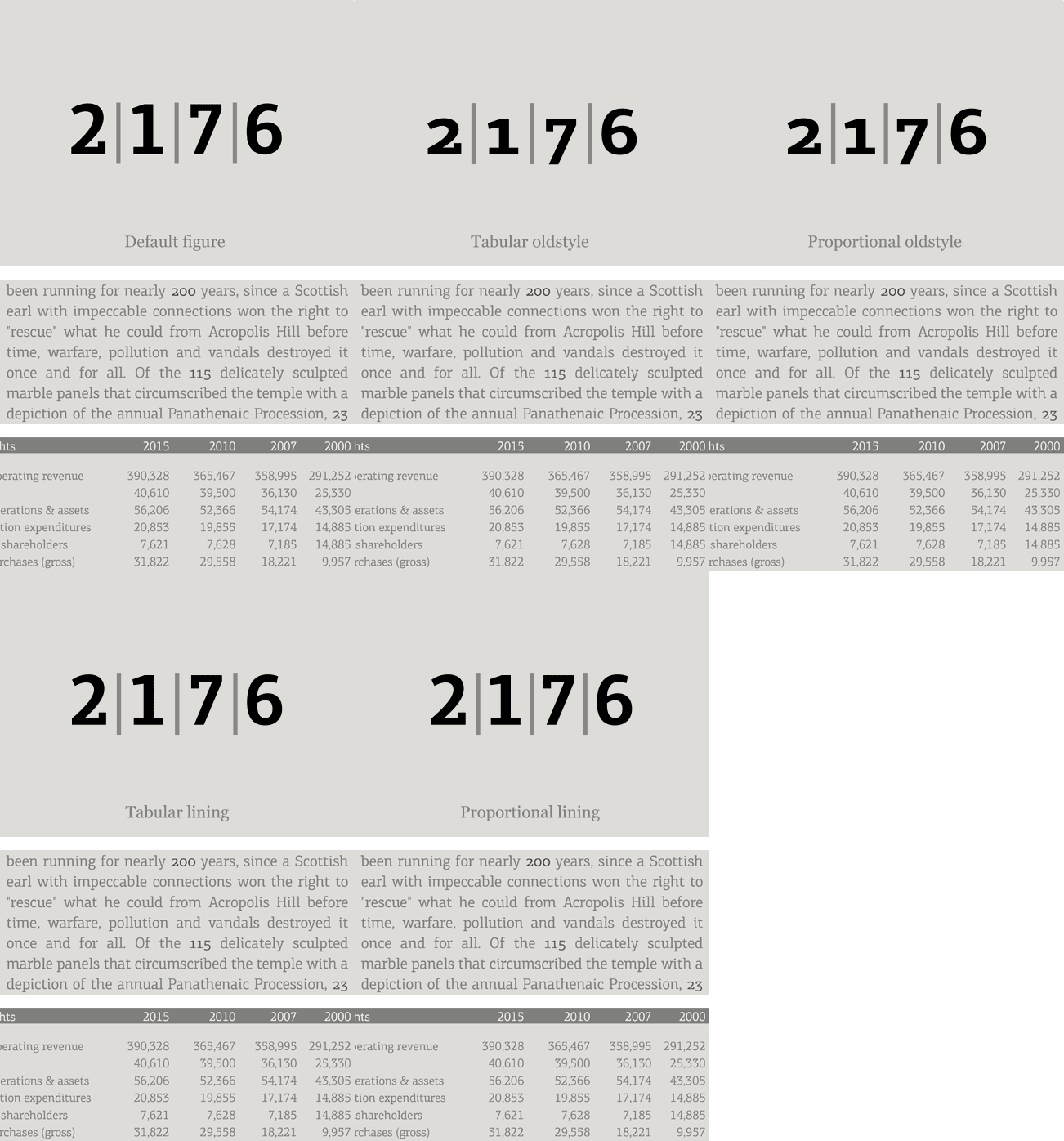
Oldstyle figures : Changes selected figures from the default lining to oldstyle i.e. numbers of
varying height. These are appropriate for use with lowercase text. They come in two different styles:
tabular and proportional. Tabular figures have equal widths (useful for tables, so that numbers line
up from one line to the next) whereas proportional have varying widths and are basically used within a sentence.
Lining figures : This feature changes selected figures from oldstyle to the default lining form. Lining figures are numbers which fit better with all-capital text and they are of the same height as capitals or a bit smaller. They also come in two different styles: tabular and proportional.
Proportional figures : Replaces selected figure glyphs which are set on tabular widths (lining or oldstyle), with corresponding glyphs set on proportional widths (lining or oldstyle).
Tabular figures : Replaces selected figure glyphs which are set on proportional widths (lining or oldstyle), with corresponding glyphs set on tabular widths (lining or oldstyle).
SCRIPTS
1250 Eastern European , 1251 Cyrillic , 1252 Latin 1 , 1253 Greek , 1254 Turkish , 1257 BalticSUPPORTED LANGUAGES
Albanian, Bosnian (Latin), Croatian, Czech, Hungarian, Polish, Romanian, Slovak, Slovenian, Sorbian, Azeri (Cyrillic), Belarusian, Bosnian (Cyrillic), Bulgarian, Kyrgyz, Macedonian (FYROM), Moldovian, Mongolian, Russian, Serbian, Tatar, Ukrainian, Uzbek (Cyrillic), Afrikaans, Alsatian, Basque, Bislama, Breton, Catalan, Chamorro, Danish, Dutch, English, Faroese, Finnish, Flemish, Franco-Provencal, French, Frisian, Friulian, Galician, German, Greenlandic, Icelandic, Indonesian, Irish, Italian, Ladin, Latin, Luxembourgish, Malay, ManxGaelic, Norwegian (Bokmål), Norwegian (Nynorsk), Occitan, Portuguese, Rhaeto-Romance, Romansh, Sami (Inari), Sami (Lule), Sami (Skolt), Sami (Southern), ScottishGaelic, Spanish, Swahili, Swedish, Tagalog, Walloon, Welsh, Greek, Azeri (Latin), Kurdish (Latin), Turkish, Uzbek (Latin), Estonian, Latvian, LithuanianNAME
PF Centro Slab PressFORMAT
OpenType PSPACKAGE
Family of 16 fonts (also available as separate weights)GLYPHS
659 glyphs /font
PRO FEATURES
Standard f-Ligatures, Oldstyle Figures (tabular/proportional), Lining Figures (tabular/proportional)
PRICE
family: €625.00single weight: €65.00