


Specimen
Test Driver
Brummell
Based on a design which was originally commissioned by a financial institution, Brummell takes a more simplistic geometric approach without missing its original humanist characteristics. In fact, Brummell combines classical organic proportions with sharp geometrics, resulting a less mechanical but refined structure.
€625.00 complete family
Brummell
Copyright ©2016
Designer: Panos Vassiliou
Based on a design which was originally commissioned by a financial institution in 2008, Brummell takes a more simplistic geometric approach without missing its original humanist characteristics. In fact, Brummell combines classical organic proportions (such as the varying width of capitals) with sharp geometrics, resulting to a less mechanical but refined structure. It is firm, sharp and extremely versatile. Its large round counters introduce an engaging element which delivers clarity equally well on fine print, harsh analog signage and pixel environments. Recurring minimal shapes in Brummell are interrupted by more traditional and easily perceived forms (such as the two-storeyed roman ‘a’ with a vertical spur, or the traditional ‘r’) in order to maximize legibility.
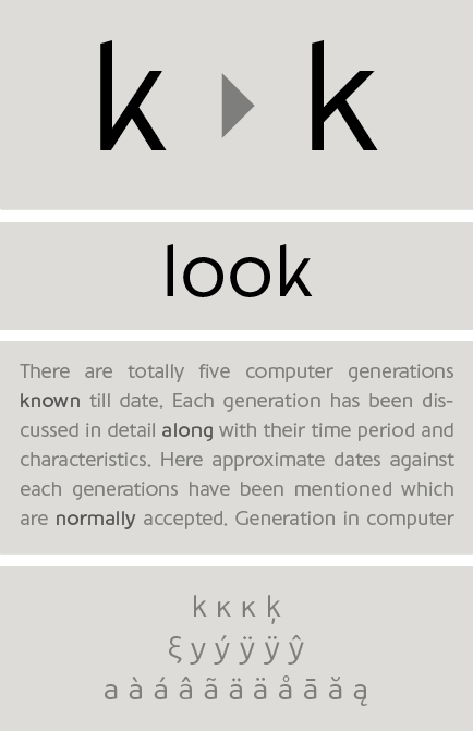
Brummell exudes a progressive, elegant and understated personality, which coupled with its natural wit comes out distinctively simple. It is carefully tuned to fit long text with the right balance of rhythm, harmony and a subtle dose of individuality pronounced by the distinct diamond-shaped dots above letters such as ‘i’ and ‘j’ or characters such as the smart two-stroke ‘k’ (an homage to the one-stroke oldstyle lowercase Greek kappa).
Its vertical strokes grow into angled endings whereas curved strokes and open counter shapes are terminated with vertical endings. On the other hand, the ascenders and descenders are quite compact to allow tight leading.
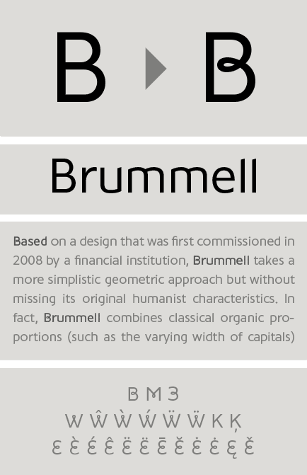
Designed for extended reading as well as signage applications, Brummell accommodates both by cleverly combining narrow letterforms (such as ‘b’ or ‘n’), with spacious counters and open shapes such as the circular ‘o’ or ‘c’. This technique offers economy of space without sacrificing legibility even from a distance. The addition of distinctive shapes (such as ‘k’), whimsical alternates (such as the cursive ‘B’) or humanist proportions, create a synergy of characteristics which provide an understated contemporary quality, lacking from most mainstream san serifs.
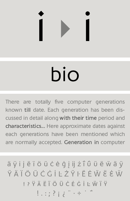
The strokes are simple and monolinear and for those who prefer a less striking impact, there is a number of subtle alternate glyphs such as letters ‘i’ and ‘j’ with round instead of diamond-shaped dots.
Brummell is a multiscript typeface which supports Latin, Greek and Cyrillic. The family consists of a total 16 styles from Hairline to Black including italics.
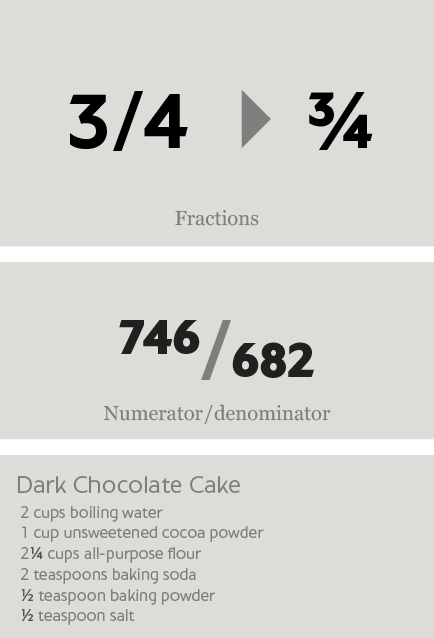
Fractions: Figures separated by slash, are replaced with diagonal fractions.
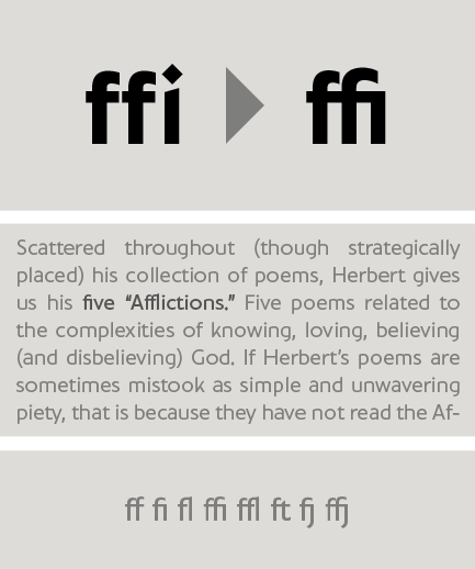
Ligatures : Replaces a sequence of glyphs with a single glyph, creating a professional-looking text with no peculiar collisions among letters. This feature covers the standard f-ligatures, as well as few other ones used in normal conditions.
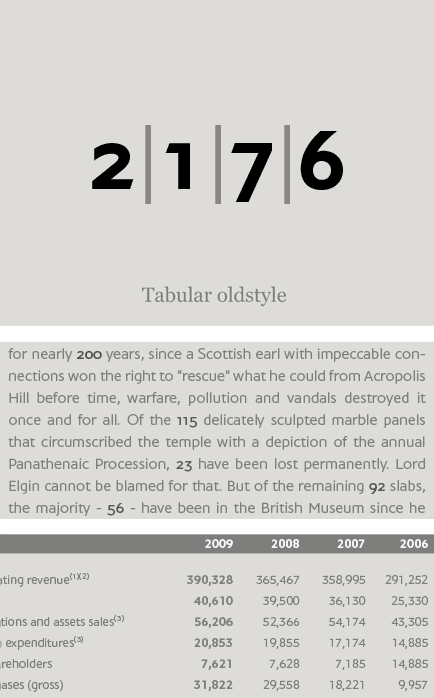
Oldstyle figures : Changes selected figures from the default lining to oldstyle i.e. numbers of
varying height. These are appropriate for use with lowercase text. They come in two different styles:
tabular and proportional. Tabular figures have equal widths (useful for tables, so that numbers line
up from one line to the next) whereas proportional have varying widths and are basically used within a sentence.
Lining figures : This feature changes selected figures from oldstyle to the default lining form. Lining figures are numbers which fit better with all-capital text and they are of the same height as capitals or a bit smaller. They also come in two different styles: tabular and proportional.
Proportional figures : Replaces selected figure glyphs which are set on tabular widths (lining or oldstyle), with corresponding glyphs set on proportional widths (lining or oldstyle).
Tabular figures : Replaces selected figure glyphs which are set on proportional widths (lining or oldstyle), with corresponding glyphs set on tabular widths (lining or oldstyle).
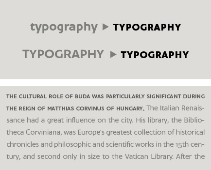
Small Caps: This feature formats lowercase text as small caps. These are not computer generated scaled-down versions of capitals, but rather glyphs which have been designed to match the weight and proportions of the rest of the family characters. They are often used in combination with oldstyle figures, for acronyms and abbreviations and stylistically at the beginning of a paragraph (this feature includes Latin and Greek small caps).
Small Caps from Capitals: Replaces capital glyphs with small caps (this feature includes Latin and Greek small caps).
Stylistic Alternates Set1: A set of stylistic variant glyphs that replace one standard glyph with its alternate form which is designed to work better within the text or add a certain flair to the page. Once you turn it on, glyphs are replaced automatically.
Stylistic Alternates Set2: A second set of stylistic variant glyphs that replace one standard glyph with its alternate form which is designed to work better within the text or add a certain flair to the page. Once you turn it on, glyphs are replaced automatically.
Stylistic Alternates: A third set of stylistic variant glyphs that replace standard glyphs which include diamond dots by their alternate form with a round dot. Once you turn it on, glyphs are replaced automatically.
Superiors: Replaces lining and oldstyle figures with superior figures and lowercase letters with
superior letters. These superior glyphs are not computer generated scaled-down versions but are rather
redesigned to match the weight of the regular glyphs. Superior figures are used mainly for footnotes
and superior letters for abbreviated titles (this feature includes Latin as well as Greek superior
lowercase and capital letters).
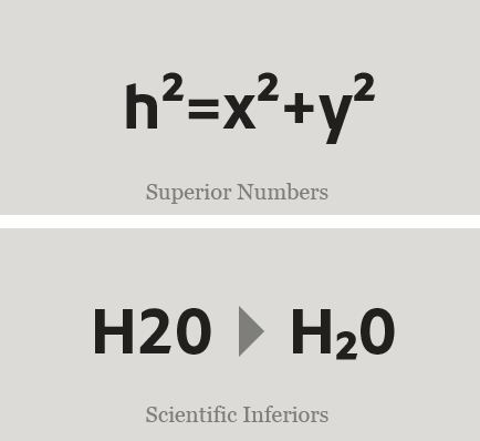
Scientific inferiors: Replaces lining and oldstyle figures with inferior figures. They have been
designed to match the weight of the regular glyphs and sit lower than the standard baseline. Used
primarily for mathematical and chemical notations.
SCRIPTS
1250 Eastern European , 1251 Cyrillic , 1252 Latin 1 , 1253 Greek , 1254 Turkish , 1257 BalticSUPPORTED LANGUAGES
Albanian, Bosnian (Latin), Croatian, Czech, Hungarian, Polish, Romanian, Slovak, Slovenian, Sorbian, Azeri (Cyrillic), Belarusian, Bosnian (Cyrillic), Bulgarian, Kyrgyz, Macedonian (FYROM), Moldovian, Mongolian, Russian, Serbian, Tatar, Ukrainian, Uzbek (Cyrillic), Afrikaans, Alsatian, Basque, Bislama, Breton, Catalan, Chamorro, Danish, Dutch, English, Faroese, Finnish, Flemish, Franco-Provencal, French, Frisian, Friulian, Galician, German, Greenlandic, Icelandic, Indonesian, Irish, Italian, Ladin, Latin, Luxembourgish, Malay, ManxGaelic, Norwegian (Bokmål), Norwegian (Nynorsk), Occitan, Portuguese, Rhaeto-Romance, Romansh, Sami (Inari), Sami (Lule), Sami (Skolt), Sami (Southern), ScottishGaelic, Spanish, Swahili, Swedish, Tagalog, Walloon, Welsh, Greek, Azeri (Latin), Kurdish (Latin), Turkish, Uzbek (Latin), Estonian, Latvian, LithuanianNAME
PF BrummellFORMAT
OpenType PSPACKAGE
Family of 16 fonts (also available as separate weights)GLYPHS
994 glyphs /font
PRO FEATURES
Access All Alternates, Small Capitals From Capitals, Discretionary Ligatures, Denominators, Fractions, Standard Ligatures, Lining Figures, Numerators, Oldstyle Figures, Proportional Figures, Scientific Inferiors, Small Capitals, Stylistic Set 2, Superscript, Tabular Figures
PRICE
family: €625.00single weight: €65.00