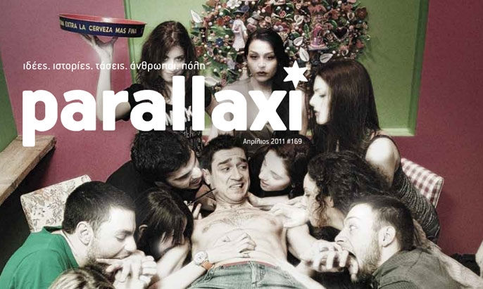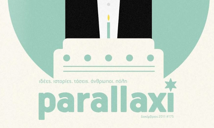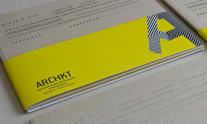


Specimen
Test Driver
Handbook Pro
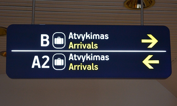
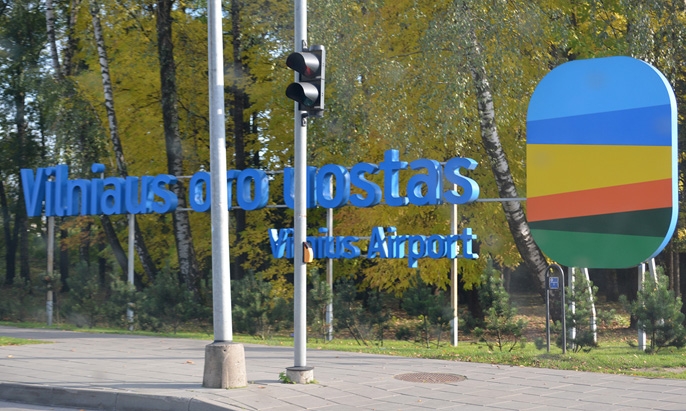
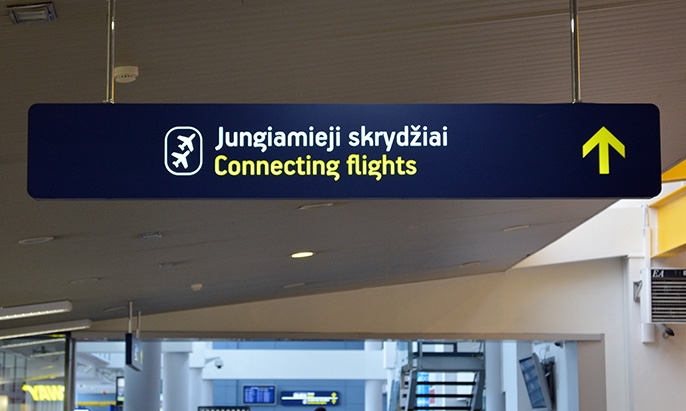
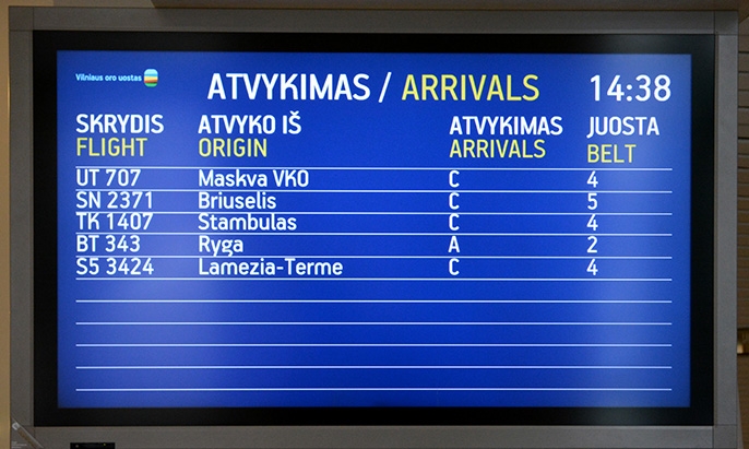
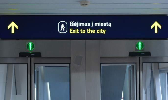
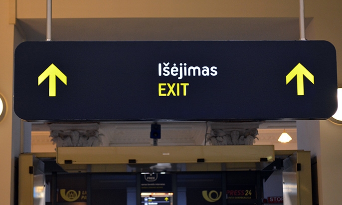
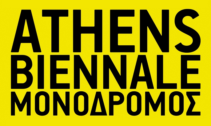
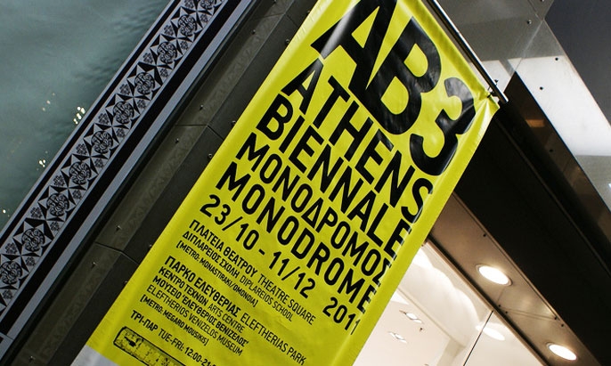
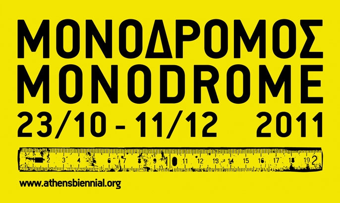
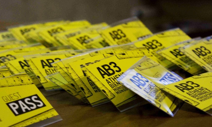
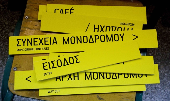
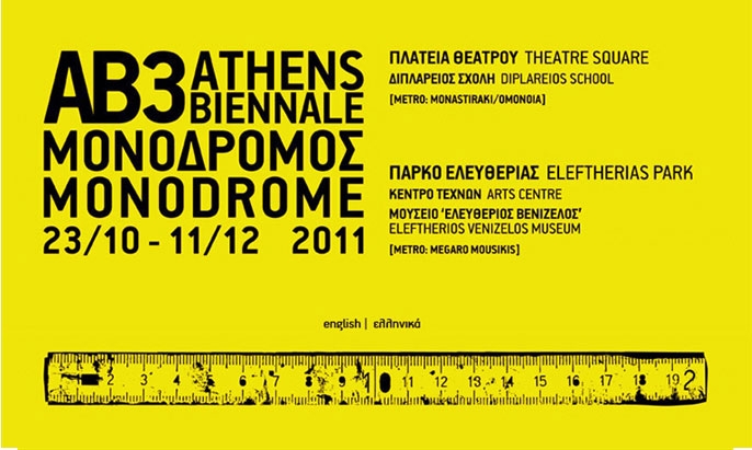
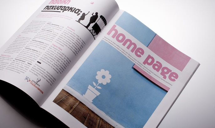
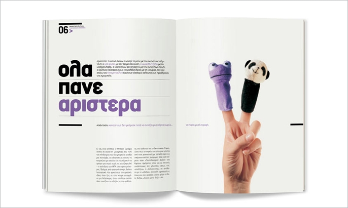
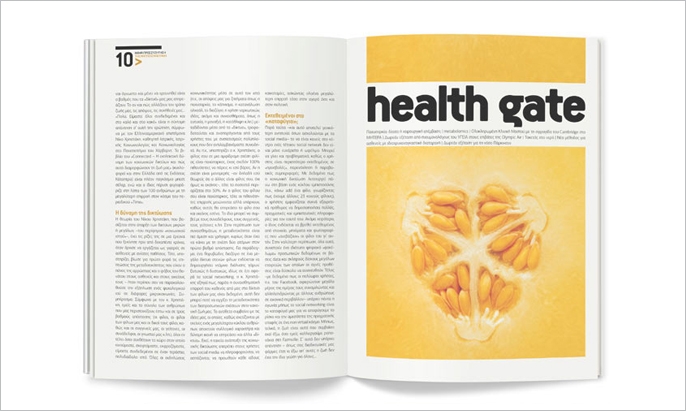
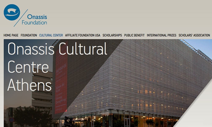
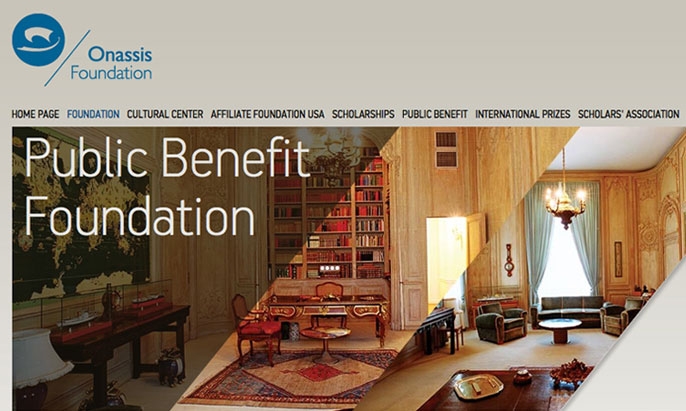
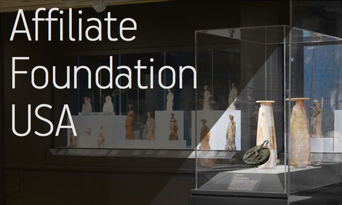
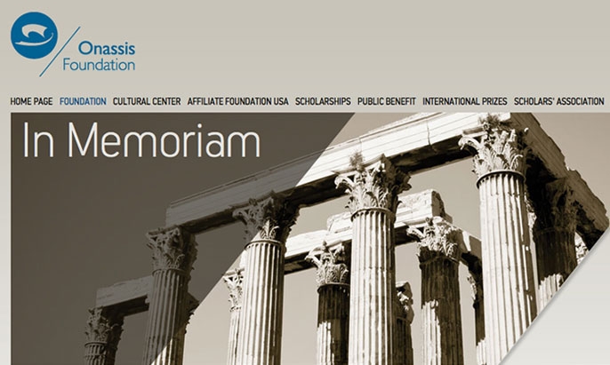
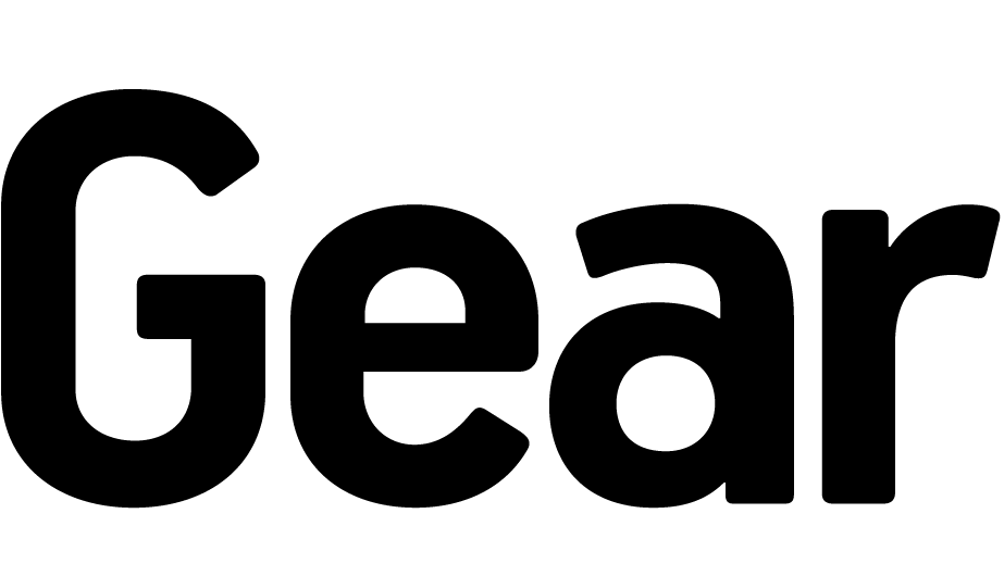
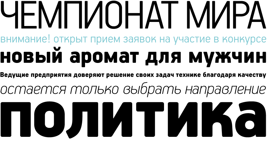
This typeface is the result of an attempt to modernize DIN, by introducing round smooth corners and distinct design elements to several characters like ‘a, g, k, m’, without compromising legibility. In order to retain its sharpness, inner corners as well as junction points were left steep.
€585.00 complete family
Handbook Pro
Copyright ©2005-2007
Designer: Panos Vassiliou
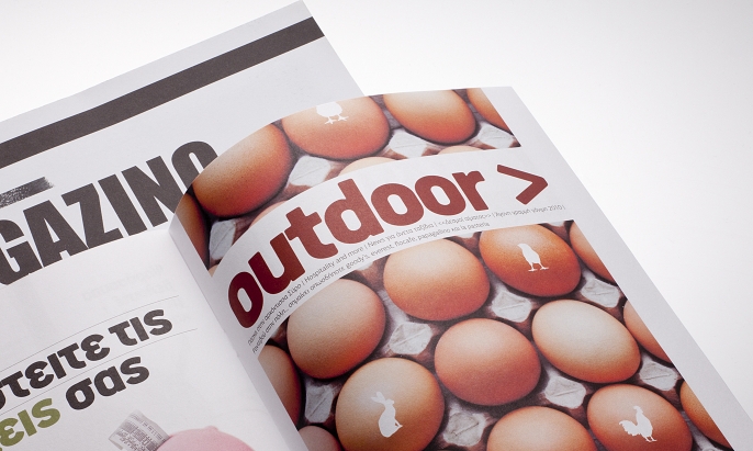
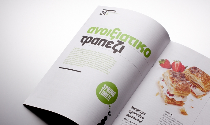
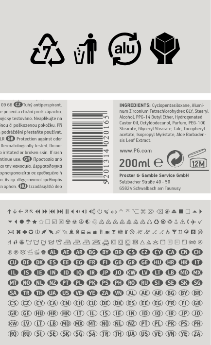
This typeface is the result of an attempt to modernise the characteristics of DIN, by introducing slightly rounded corners and distinct design elements to several characters such as ‘a, g, k, m’, without compromising legibility. In order to retain its sharpness, inner corners as well as junction points were left steep. This is a balanced typeface which performs exceptionally well with long texts at small point sizes. It has a strong welcoming presence and at the same time it feels structured and established enough to carry an international brand. Handbook Pro comes loaded with a number of special features. The family consists of 14 fonts -from black to extra thin including true italics- for complex type requirements. It supports 21 special opentype features like small caps, fractions, ordinals, etc. and offers multilingual support for all European languages including Greek and Cyrillic. There is also a set of very interesting stylistic alternates which can be used to either add a refreshing flair to your design or bring it down to a more conservative level. Finally, every font in this family has been completed with 270 copyright-free symbols, some of which have been proposed by several international organisations for packaging, public areas, environment, transportation, computers, fabric care and urban life.
Fractions : Figures separated by slash, are replaced with diagonal fractions.
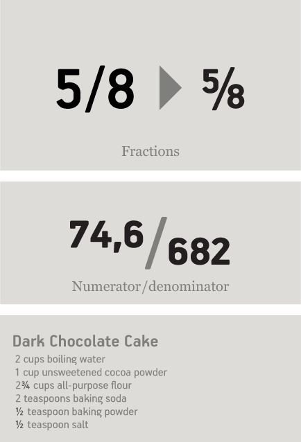
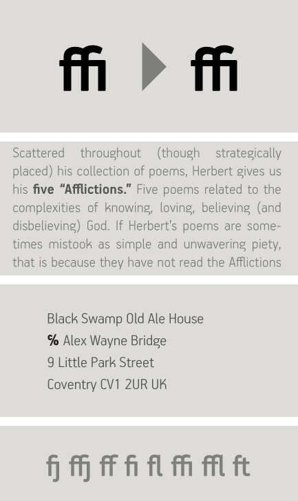
Ligatures: Replaces a sequence of glyphs with a single glyph, creating a professional-looking text with no peculiar collisions among letters. This feature covers the standard f-ligatures, as well as few other ones used in normal conditions.
Discretional ligatures:
Replaces a sequence of glyphs with a single glyph. It differs from the previous feature in the fact that it activates special (non-standard) ligatures for Latin and Greek.
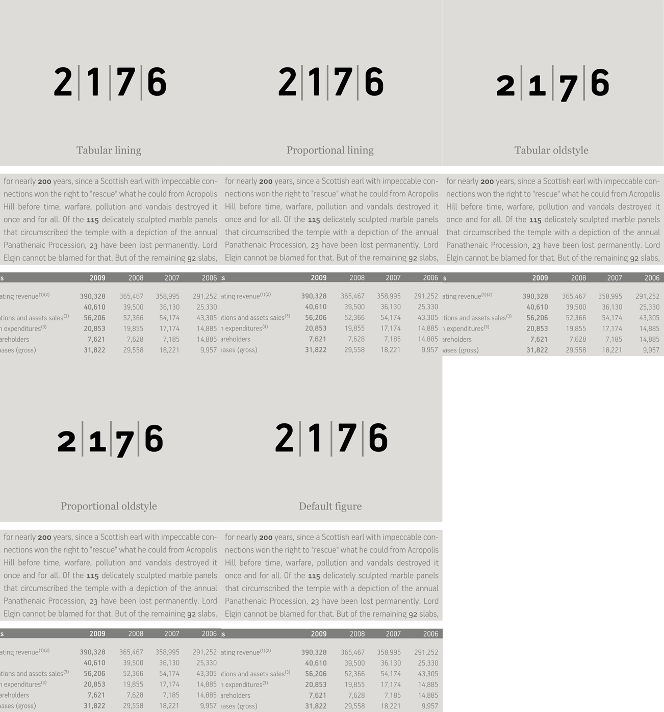
Oldstyle figures : Changes selected figures from the default lining to oldstyle i.e. numbers of
varying height. These are appropriate for use with lowercase text. They come in two different styles:
tabular and proportional. Tabular figures have equal widths (useful for tables, so that numbers line
up from one line to the next) whereas proportional have varying widths and are basically used within a sentence.
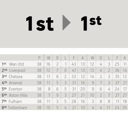
Lining figures : This feature changes selected figures from oldstyle to the default lining form. Lining figures are numbers which fit better with all-capital text and they are of the same height as capitals or a bit smaller. They also come in two different styles: tabular and proportional.
Proportional figures : Replaces selected figure glyphs which are set on tabular widths (lining or oldstyle), with corresponding glyphs set on proportional widths (lining or oldstyle).
Tabular figures : Replaces selected figure glyphs which are set on proportional widths (lining or oldstyle), with corresponding glyphs set on tabular widths (lining or oldstyle).
Ordinals : Contextually replaces default alphabetic glyphs which follow numbers with superscripted glyphs and the sequence ‘No’ with the numero character (No). This feature includes Latin as well as Greek lowercase and capital ordinals.
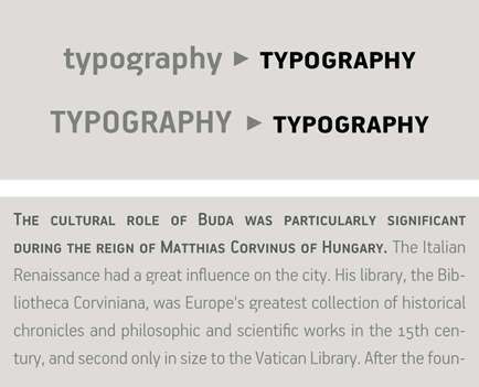
Small Caps: This feature formats lowercase text as small caps. These are not computer generated scaled-down versions of capitals, but rather glyphs which have been designed to match the weight and proportions of the rest of the family characters. They are often used in combination with oldstyle figures, for acronyms and abbreviations and stylistically at the beginning of a paragraph (this feature includes Latin, Greek and Cyrillic small caps).
Small Caps from Capitals: Replaces capital glyphs with small caps (this feature includes Latin, Greek and Cyrillic small caps).
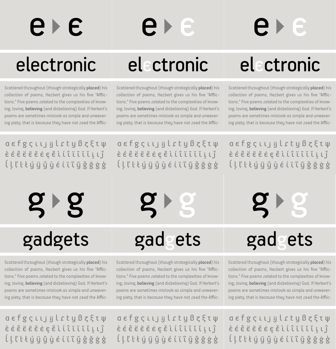
Stylistic Alternates : Replaces non-standard glyphs with alternate forms purely for aesthetic reasons.
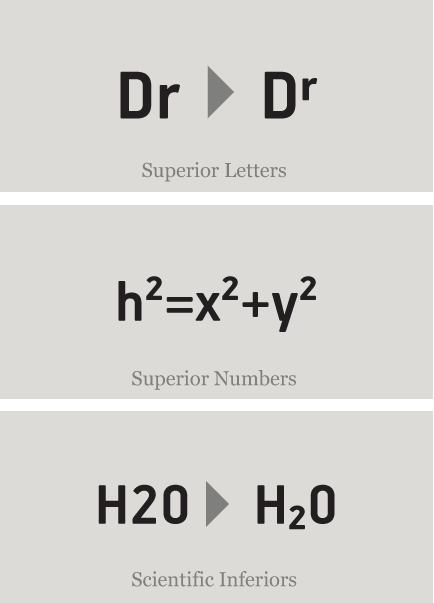
Superiors : Replaces lining and oldstyle figures with superior figures and lowercase letters with
superior letters. These superior glyphs are not computer generated scaled-down versions but are rather
redesigned to match the weight of the regular glyphs. Superior figures are used mainly for footnotes
and superior letters for abbreviated titles (this feature includes Latin as well as Greek superior
lowercase and capital letters).
Scientific inferiors : Replaces lining and oldstyle figures with inferior figures. They have been
designed to match the weight of the regular glyphs and sit lower than the standard baseline. Used
primarily for mathematical and chemical notations.
Ornaments/Various Symbols : This feature may replace the bullet or other characters with any of the available ornaments/symbols. All of them are best accessed from the program’s ‘Glyphs Palette’ when available. There is a total of 270 ornaments/symbols included for packaging, public areas, environment, transportation, computers, fabric care, urban life.
SCRIPTS
1250 Eastern European , 1258 Vietnamese , 1251 Cyrillic , 1252 Latin 1 , 1253 Greek , 1254 Turkish , 1257 BalticSUPPORTED LANGUAGES
Albanian, Bosnian (Latin), Croatian, Czech, Hungarian, Polish, Romanian, Slovak, Slovenian, Sorbian, Vietnamese, Azeri (Cyrillic), Belarusian, Bosnian (Cyrillic), Bulgarian, Kyrgyz, Macedonian (FYROM), Moldovian, Mongolian, Russian, Serbian, Tatar, Ukrainian, Uzbek (Cyrillic), Afrikaans, Alsatian, Basque, Bislama, Breton, Catalan, Chamorro, Danish, Dutch, English, Faroese, Finnish, Flemish, Franco-Provencal, French, Frisian, Friulian, Galician, German, Greenlandic, Icelandic, Indonesian, Irish, Italian, Ladin, Latin, Luxembourgish, Malay, ManxGaelic, Norwegian (Bokmål), Norwegian (Nynorsk), Occitan, Portuguese, Rhaeto-Romance, Romansh, Sami (Inari), Sami (Lule), Sami (Skolt), Sami (Southern), ScottishGaelic, Spanish, Swahili, Swedish, Tagalog, Walloon, Welsh, Greek, Azeri (Latin), Kurdish (Latin), Turkish, Uzbek (Latin), Estonian, Latvian, LithuanianNAME
PF Handbook ProFORMAT
OpenType PSPACKAGE
Family of 14 fonts (also available as separate weights)GLYPHS
1253 glyphs /font
incl. 270 symbols
PRO FEATURES
Small Caps, Standard f-Ligatures, Discretionary Ligatures, Oldstyle Figures (tabular/proportional), Lining Figures (tabular/proportional), Superiors (numerals/lowercase letters), Scientific Inferiors, Fractions, Ordinals, Stylistic Alternates /Stylistic Set 1, Numerators / denominators, Capital spacing, Ornaments/various symbols.
PRICE
family: €585.00
single weight: €65.00
