





Specimen
Test Driver
Champion Script Pro
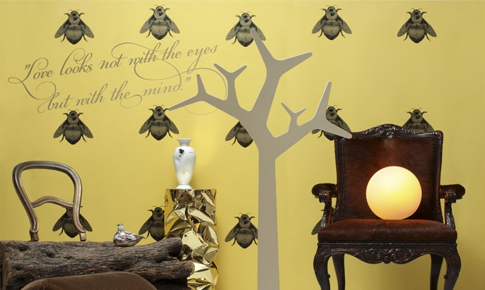
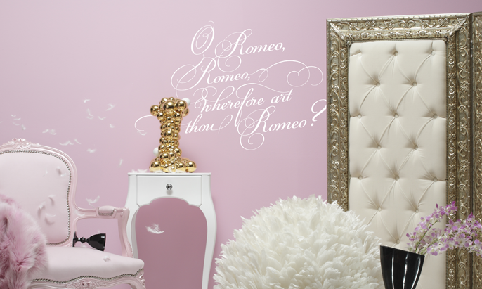
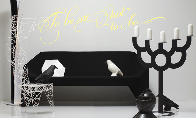
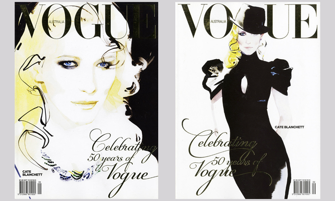
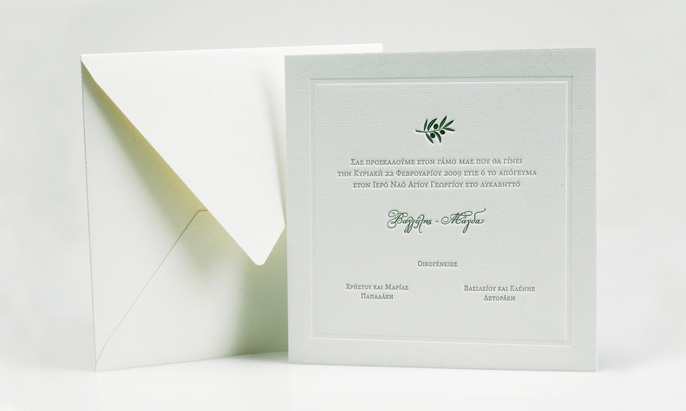
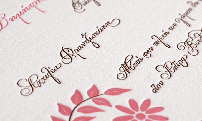
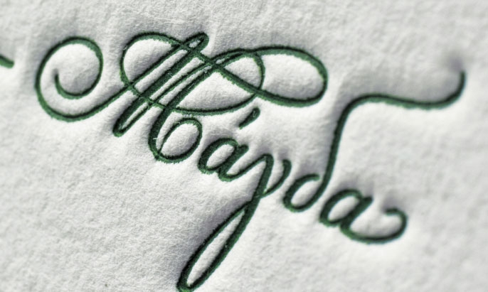
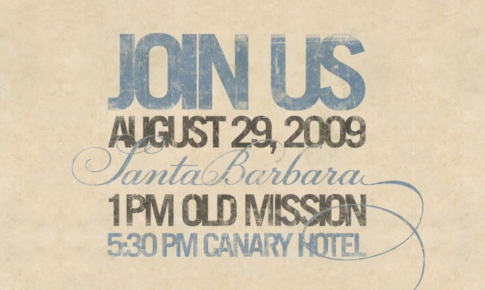
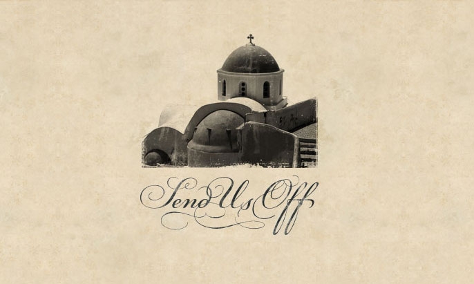
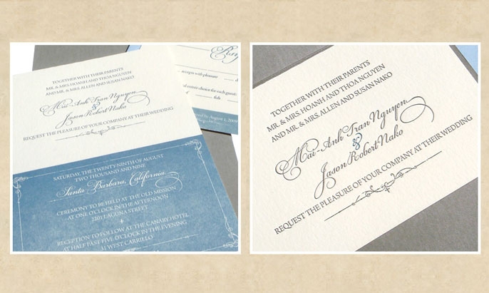
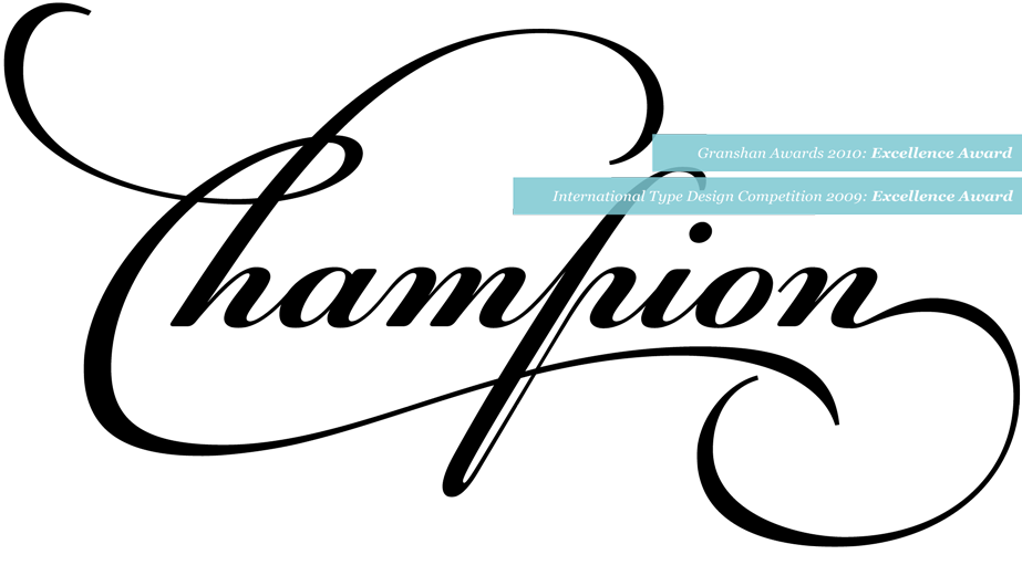
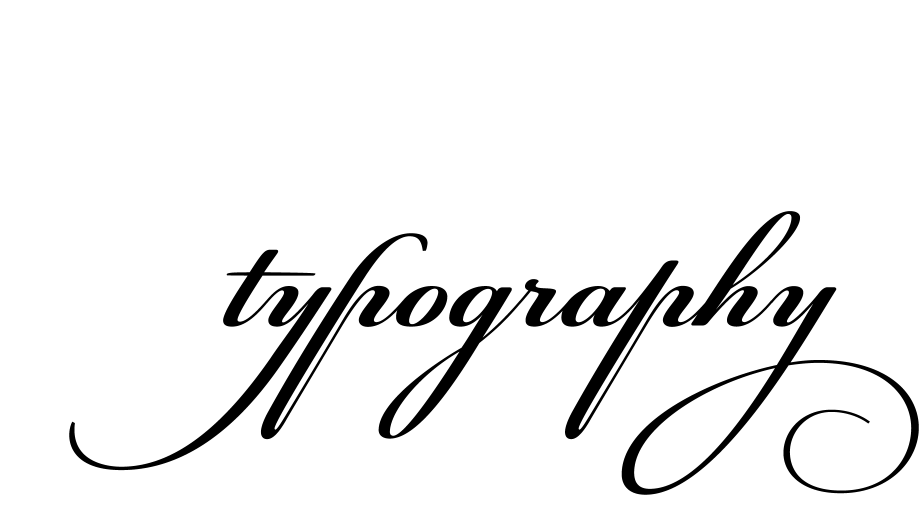
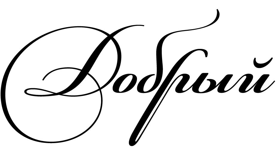
PF Champion Script Pro is the most advanced and powerful script ever made. Developed over a period of two and a half years, each one of the 2 weights is loaded with 4300 glyphs(!), offering simultaneous support for all European languages based on the Latin, Greek and Cyrillic scripts.
€225.00 complete family
Champion Script® Pro
Copyright ©2007
Designer: Panos Vassiliou
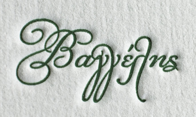
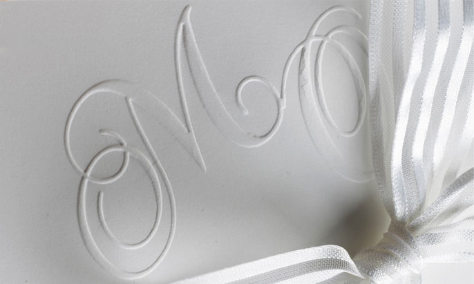
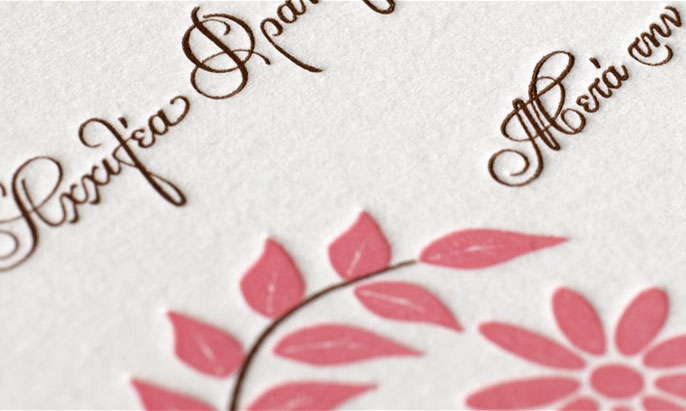
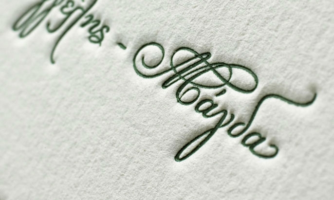
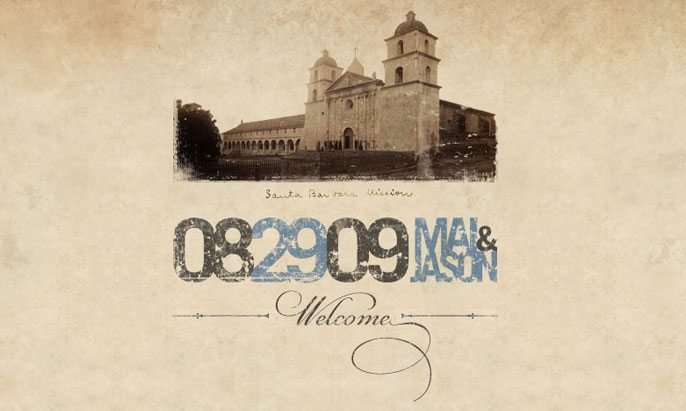
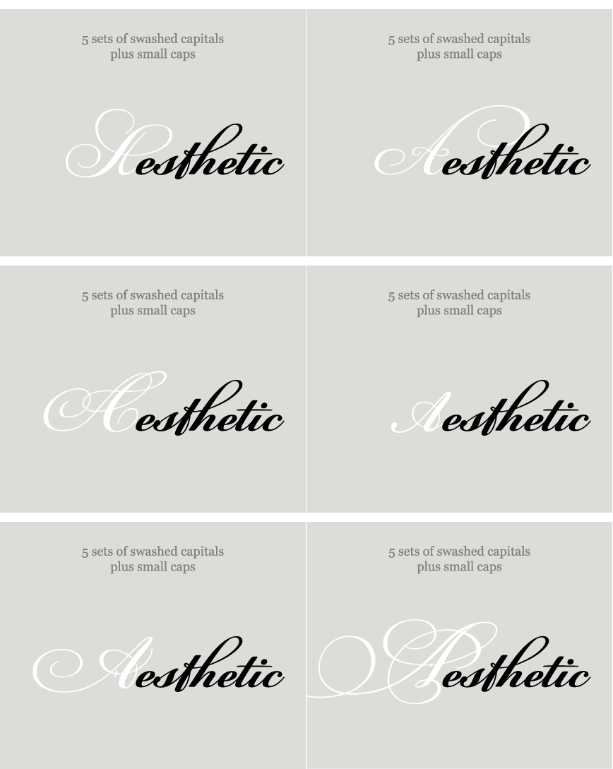
PF Champion Script Pro is the most advanced and powerful script ever made. This typeface was first presented in June 2007 at the 3rd International Conference on Typography and Visual Communication (ICTVC) and was met with rave reviews. It is based mainly on the manuscripts of the 18th century english calligrapher Joseph Champion. Developed over a period of two and a half years, each one of the 2 weights is loaded with 4300 glyphs(!), offering simultaneous support for all European languages based on the Latin, Greek and Cyrillic scripts. Furthermore, a wide selection of alternate forms and ligatures is included for all languages, in order to accommodate diverse design aesthetics. These alternates are either applied automatically through an advanced programming scheme, or manually through several opentype features. An attempt was made to design a contemporary script typeface with classic roots, by following certain guidelines, i.e. lowercase characters were designed so they are less inclined, have a higher x-height and are less condensed than the original. Several characters were stripped-off their connecting lines in order to enhance legibility. Four sets of alternate swashed capitals as well as a plethora of ornaments and frames (117) was included. Small caps and their alternate forms were designed to replace the capitals which disrupt the flow of text within a sentence with their extravagant swashes. All characters were carefully designed with the proper weight in order to sustain harsh printing conditions (on special papers), a situation which affects mainly the light connecting parts of calligraphic typefaces. Finally, it was programmed in such a way as to preserve handwriting qualities, by designing an extensive array of ligatures and alternate glyphs in all languages, never before released or incorporated within the same font.
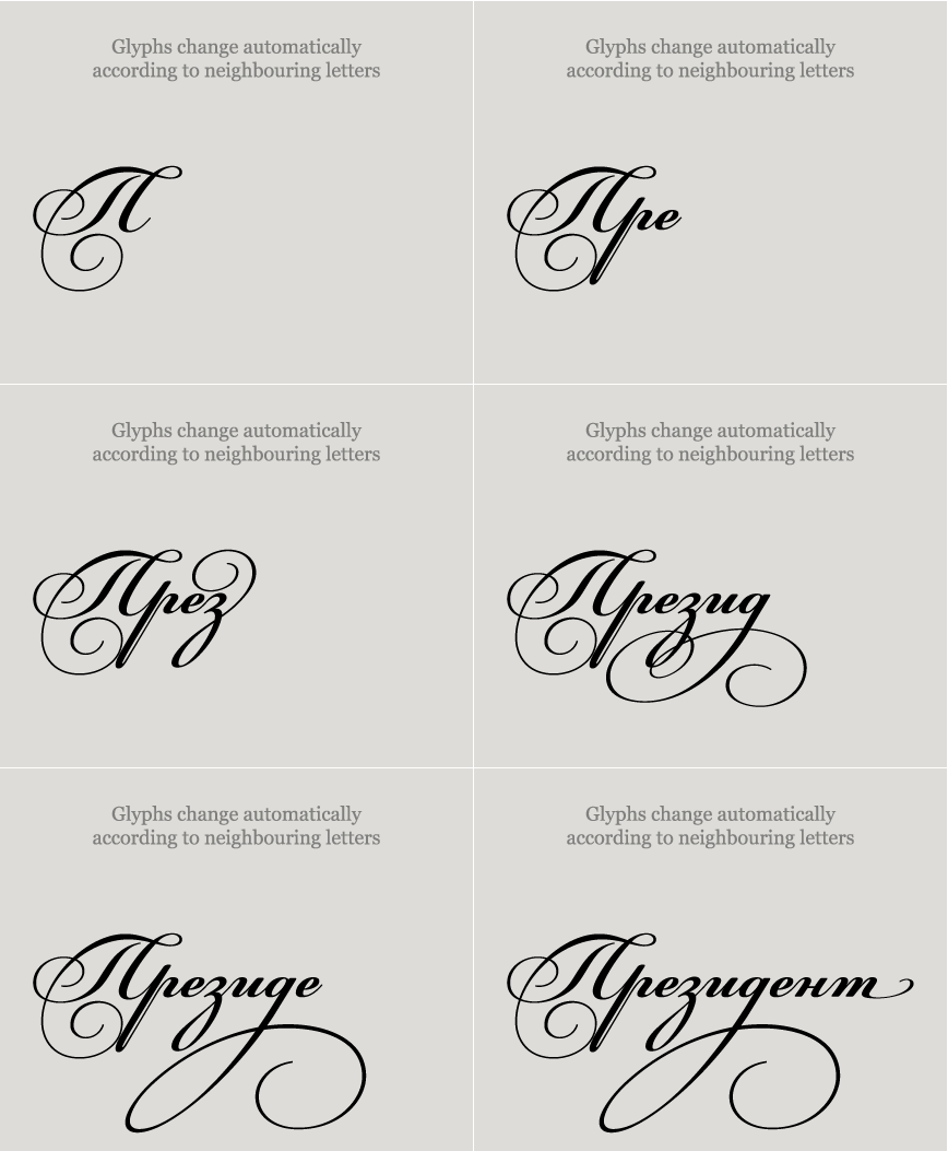
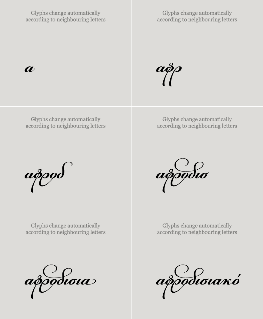
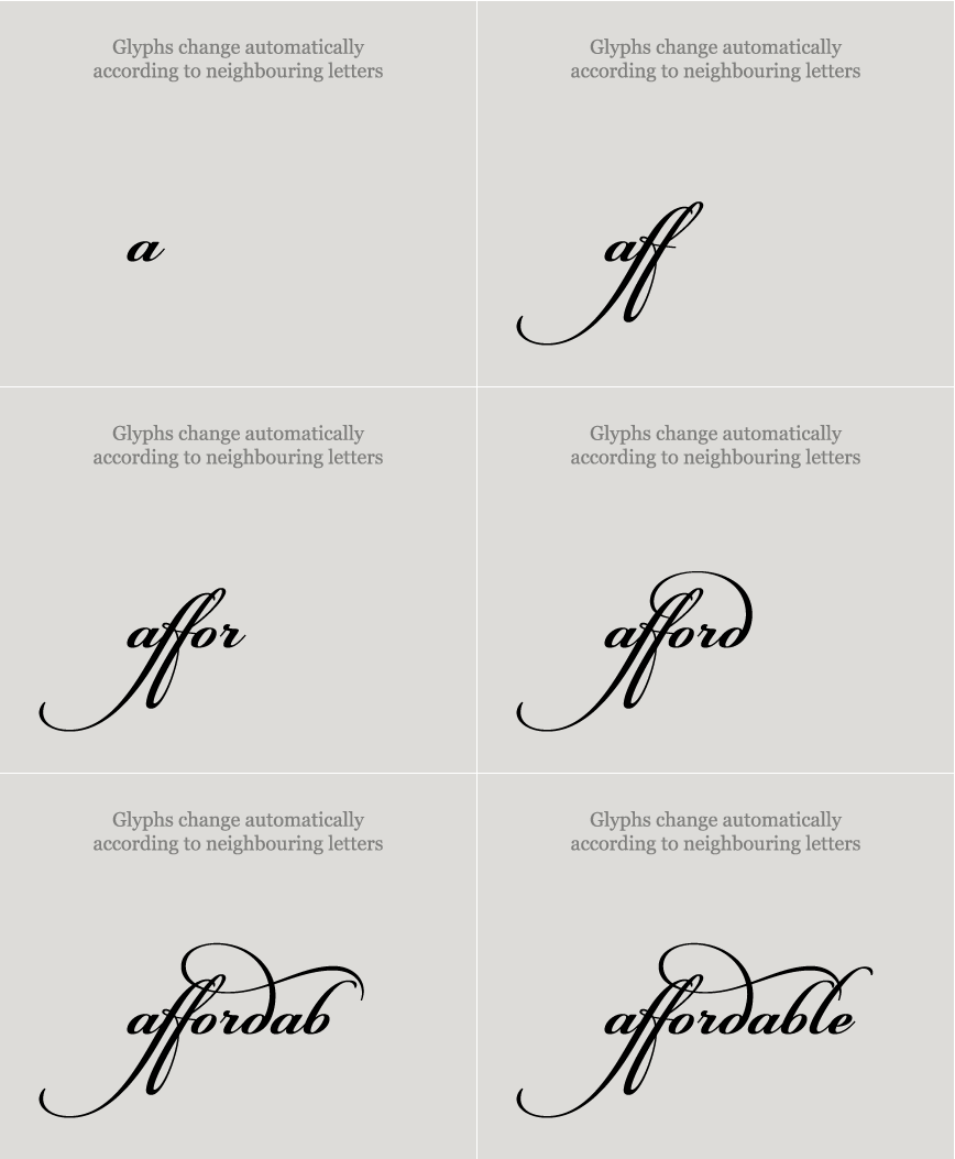
Contextual alternates : Pre-programmed to automatically replace glyphs with alternateforms which sit better next to neighbouring letters. This feature takes into consideration a number ofvariables like the shape, the type and the frequency of neighbouring letters and is best to leave ‘on’all the time. When you purchase Champion Script Pro, you get the “Attention to Details” guide whichexplains how to combine this feature and the other manual features for stunning results. Applied toLatin, Greek and Cyrillic.
Contextual alternates : Pre-programmed to automatically replace glyphs with alternate
forms which sit better next to neighbouring letters. This feature takes into consideration a number of
variables like the shape, the type and the frequency of neighbouring letters and is best to leave ‘on’
all the time. When you purchase Champion Script Pro, you get the “Attention to Details” guide which
explains how to combine this feature and the other manual features for stunning results. Applied to
Latin, Greek and Cyrillic.
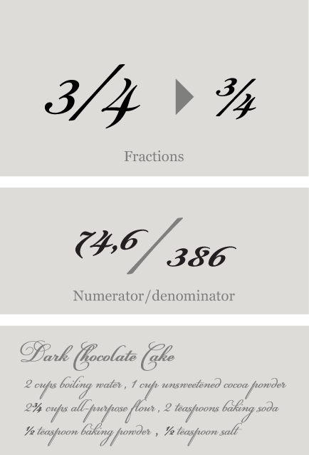
Fractions : Figures separated by slash, are replaced with diagonal fractions.
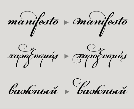
Initial forms: A set of stylistic variant glyphs which replace certain standard glyphs at the
beginning of a word with alternate initial forms. This is a manual feature which is accessed through
the glyphs palette.
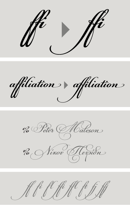
Ligatures: Replaces a sequence of glyphs with a single glyph, creating a professional-looking text with no peculiar collisions among letters. This feature covers the standard f-ligatures, as well as few other ones used in normal conditions.
Discretional ligatures: Replaces a sequence of glyphs with a single glyph. It differs from the previous feature in the fact that it activates special (non-standard) ligatures for Latin and Greek.
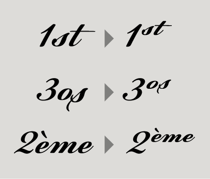
Ordinals: Contextually replaces default alphabetic glyphs which follow numbers with superscripted glyphs and the sequence ‘No’ with the numero character (No). This feature includes Latin as well as Greek lowercase and capital ordinals.
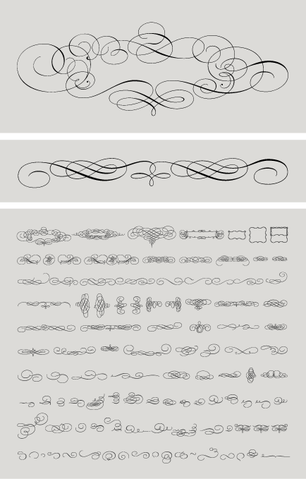
Ornaments/Various Symbols : This feature may replace the bullet or other characters with any of the available ornaments/symbols. All of them are best accessed from the program’s ‘Glyphs Palette’ when available. There is a total of 270 ornaments/symbols included for packaging, public areas, environment, transportation, computers, fabric care, urban life.
Small Caps: This feature formats lowercase text as small caps. These are not computer generated scaled-down versions of capitals, but rather glyphs which have been designed to match the weight and proportions of the rest of the family characters. They are often used in combination with oldstyle figures, for acronyms and abbreviations and stylistically at the beginning of a paragraph (this feature includes Latin, Greek and Cyrillic small caps).
Small Caps from Capitals: Replaces capital glyphs with small caps (this feature includes Latin, Greek and Cyrillic small caps).
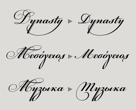
Stylistic Alternates : Replaces non-standard glyphs with alternate forms purely for aesthetic reasons.
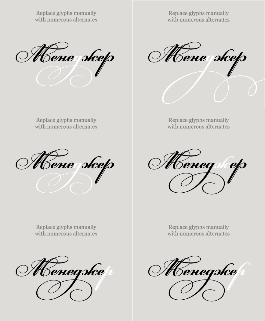
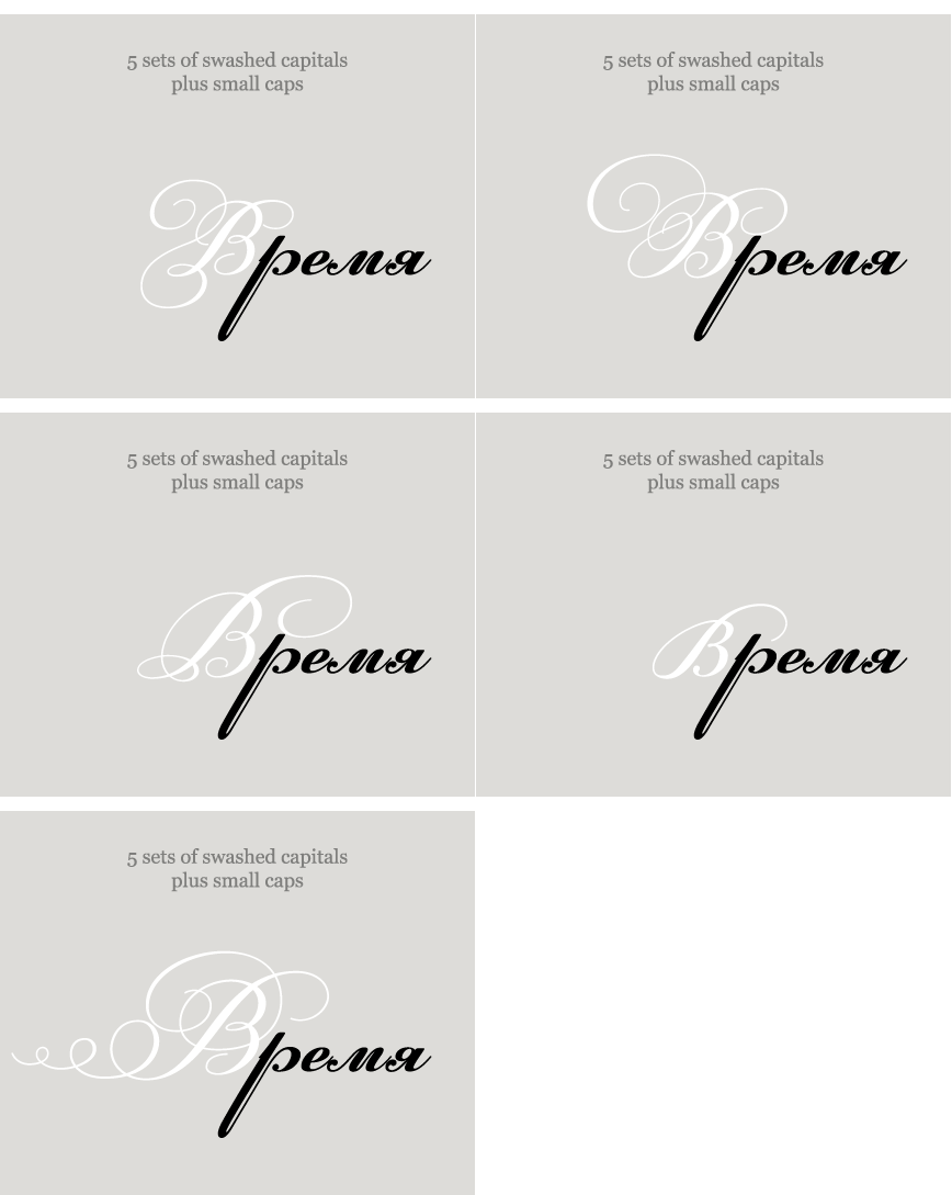
Stylistic Alternates : Replaces non-standard glyphs with alternate forms purely for aesthetic reasons.
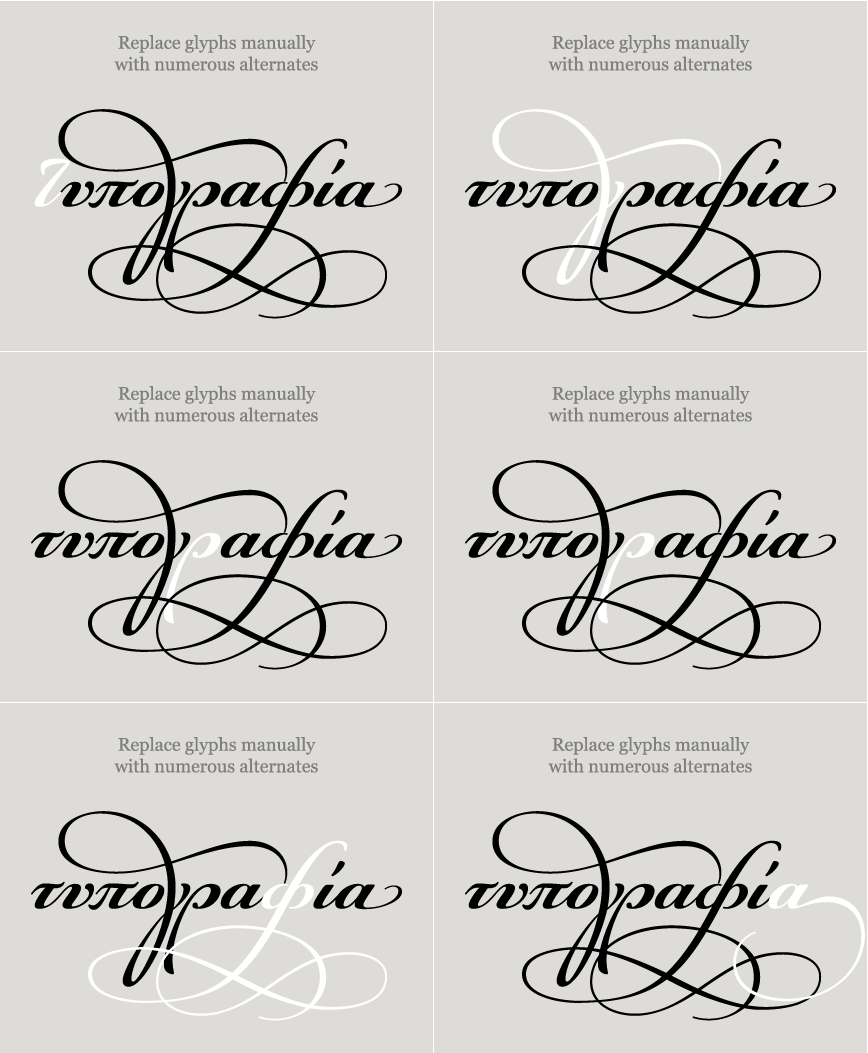
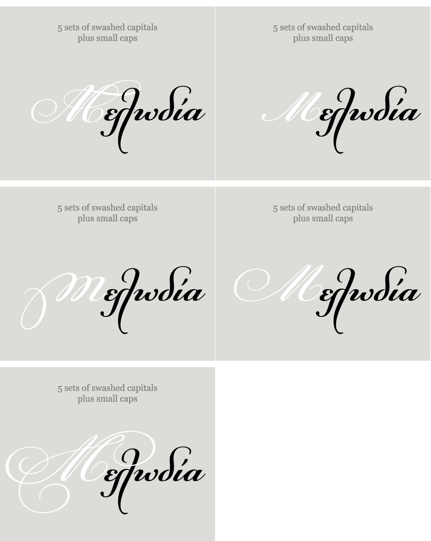
Stylistic Alternates : Replaces non-standard glyphs with alternate forms purely for aesthetic reasons.
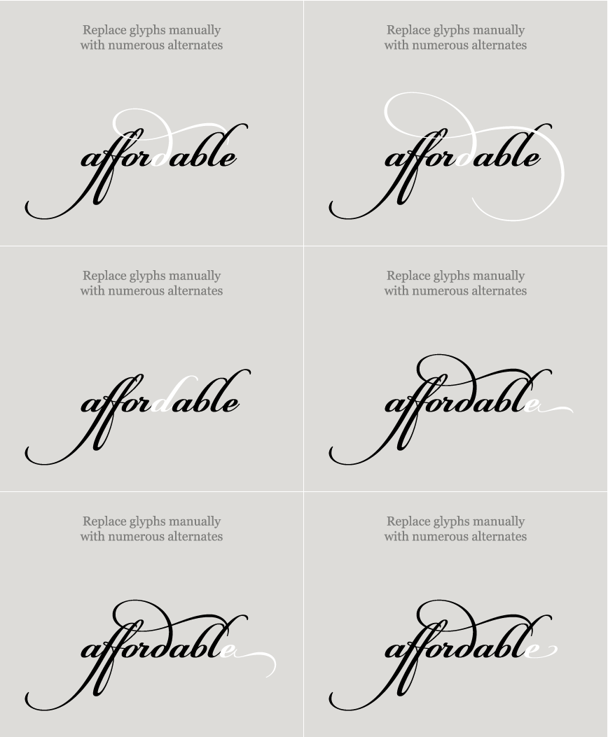
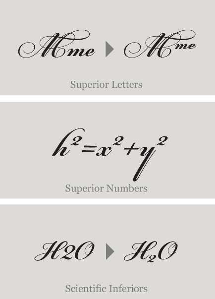
Superiors : Replaces lining and oldstyle figures with superior figures and lowercase letters with
superior letters. These superior glyphs are not computer generated scaled-down versions but are rather
redesigned to match the weight of the regular glyphs. Superior figures are used mainly for footnotes
and superior letters for abbreviated titles (this feature includes Latin as well as Greek superior
lowercase and capital letters).
Scientific inferiors : Replaces lining and oldstyle figures with inferior figures. They have been
designed to match the weight of the regular glyphs and sit lower than the standard baseline. Used
primarily for mathematical and chemical notations.
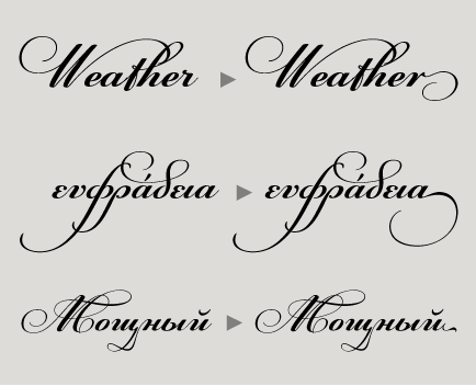
Terminal forms: A set of stylistic variant glyphs which replace certain standard glyphs at the
end of a word with alternate endings. This is a manual feature which is accessed through the glyphs
palette.
SCRIPTS
1250 Eastern European , 1251 Cyrillic , 1252 Latin 1 , 1253 Greek , Greek Extended , 1254 Turkish , 1257 BalticSUPPORTED LANGUAGES
Albanian, Bosnian (Latin), Croatian, Czech, Hungarian, Polish, Romanian, Slovak, Slovenian, Sorbian, Azeri (Cyrillic), Belarusian, Bosnian (Cyrillic), Bulgarian, Kyrgyz, Macedonian (FYROM), Moldovian, Mongolian, Russian, Serbian, Tatar, Ukrainian, Uzbek (Cyrillic), Afrikaans, Alsatian, Basque, Bislama, Breton, Catalan, Chamorro, Danish, Dutch, English, Faroese, Finnish, Flemish, Franco-Provencal, French, Frisian, Friulian, Galician, German, Greenlandic, Icelandic, Indonesian, Irish, Italian, Ladin, Latin, Luxembourgish, Malay, ManxGaelic, Norwegian (Bokmål), Norwegian (Nynorsk), Occitan, Portuguese, Rhaeto-Romance, Romansh, Sami (Inari), Sami (Lule), Sami (Skolt), Sami (Southern), ScottishGaelic, Spanish, Swahili, Swedish, Tagalog, Walloon, Welsh, Greek, GreekPolytonic, Azeri (Latin), Kurdish (Latin), Turkish, Uzbek (Latin), Estonian, Latvian, LithuanianNAME
PF Champion Script ProFORMAT
OpenType PSPACKAGE
Family of 2 fontsGLYPHS
4300 glyphs /font
incl. 117 ornaments
PRO FEATURES
Contextual Alternates, Contextual Ligatures, Localized Forms, Small Capitals From Capitals, Case-Sensitive Forms, Stylistic Alternates, Ordinals, Fractions, Initial Forms, Terminal Forms, Numerators, Denominators, Superscript, Scientific Inferiors, Standard Ligatures, Discretionary Ligatures, Historical Forms, Ornaments, Slashed Zero, Stylistic Set 1, Stylistic Set 2, Stylistic Set 3, Stylistic Set 4, Stylistic Set 5, Stylistic Set 6, Stylistic Set 7, Stylistic Set 8, Stylistic Set 9, Access All AlternatesPRICE
family: €225.00
single weight: €125.00
